Latest project story
The Green Estate
The Green Estate
Since its founding in 1994, Weston Park Cancer Charity has raised over £25million; helping to fund the work of Weston Park Hospital, develop its own range of services and advance the fight against cancer. But with one in two people diagnosed with cancer, the charity wanted to extend its reach to a total of 47,000 patients and their families — a 50% increase on current numbers. This increase was a key objective of a five-year strategic plan for the charity, and the primary driver for the rebrand.
As well as strategic ambitions, the charity was also restructuring how it promoted and delivered patient support. Previously, any supplementary services or care that patients received was provided by an independent support centre funded by the charity. To streamline its ability to provide these services, the support centre was merged with the charity. The new brand needed to unite the two organisations and make it simpler for people to identify and access the help and information they needed.
From the very beginning of the project, we immersed ourselves in the world of Weston Park. We consulted with a range of key stakeholders including patients, families, doctors, nurses, researchers, fundraisers, board members and charity staff. We attended hospital tours, observed support centre activities and ran workshops with senior members of the charity.
Through all of these activities, we gained fantastic insight into the incredible work of the charity and what it meant to all the people involved. But a key challenge we identified was that all of these positives existed in silos. In many cases, patients, medical professionals and fundraisers would be unaware of how the different aspects of the charity’s work connected. In extreme cases, people didn’t realise the charity’s involvement at all and saw it simply as a conduit for donations.
This presented a real problem, because if the work of the charity wasn’t clear to people, how could it increase support and donations?
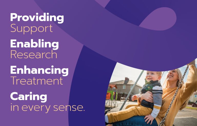
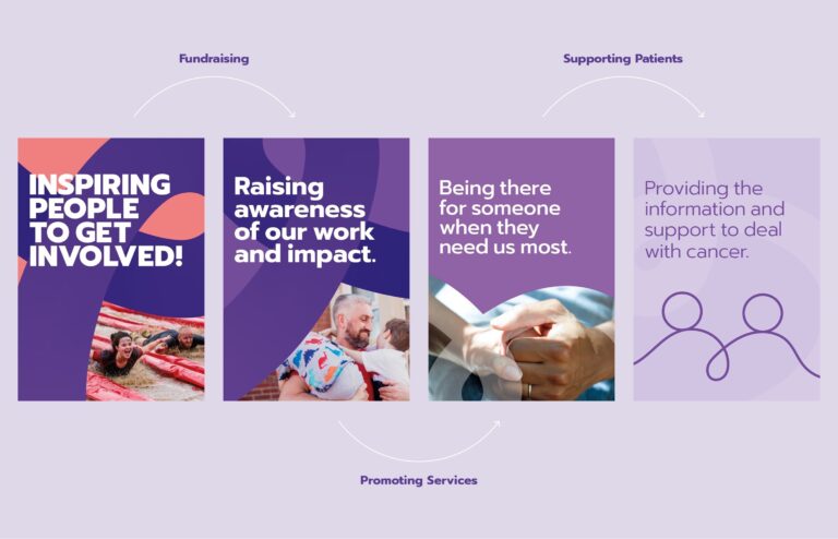
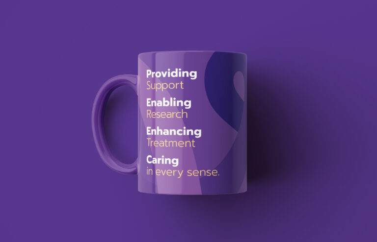
To overcome this challenge, our brand strategy defined the primary work areas of the charity as providing support, enabling research, enhancing treatment and caring in every sense. These core messaging pillars allowed the charity to channel its communications, and for the first time build a connection with the amazing stories it had to tell.
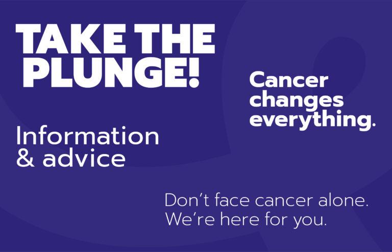
Another challenge we identified was how could the charity present itself to a very diverse audience? Previously the charity’s marketing had focused primarily on fundraising — showcasing all the things people could do to get involved and raise money. But with the merger of the charity and support centre, it also needed to provide information for patients and their families. It quickly became clear that it couldn’t present itself to someone dealing with cancer in the same way as someone who wanted to do a charity skydive. The brand needed to respond to the needs of its audience.
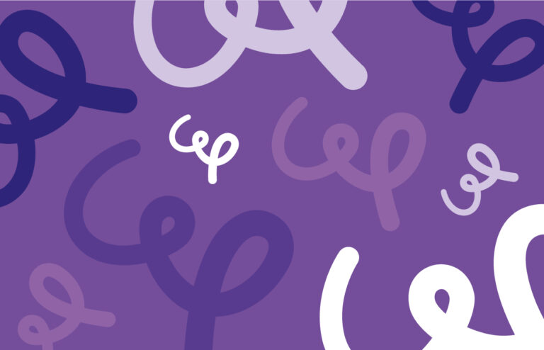
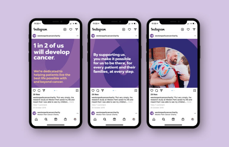
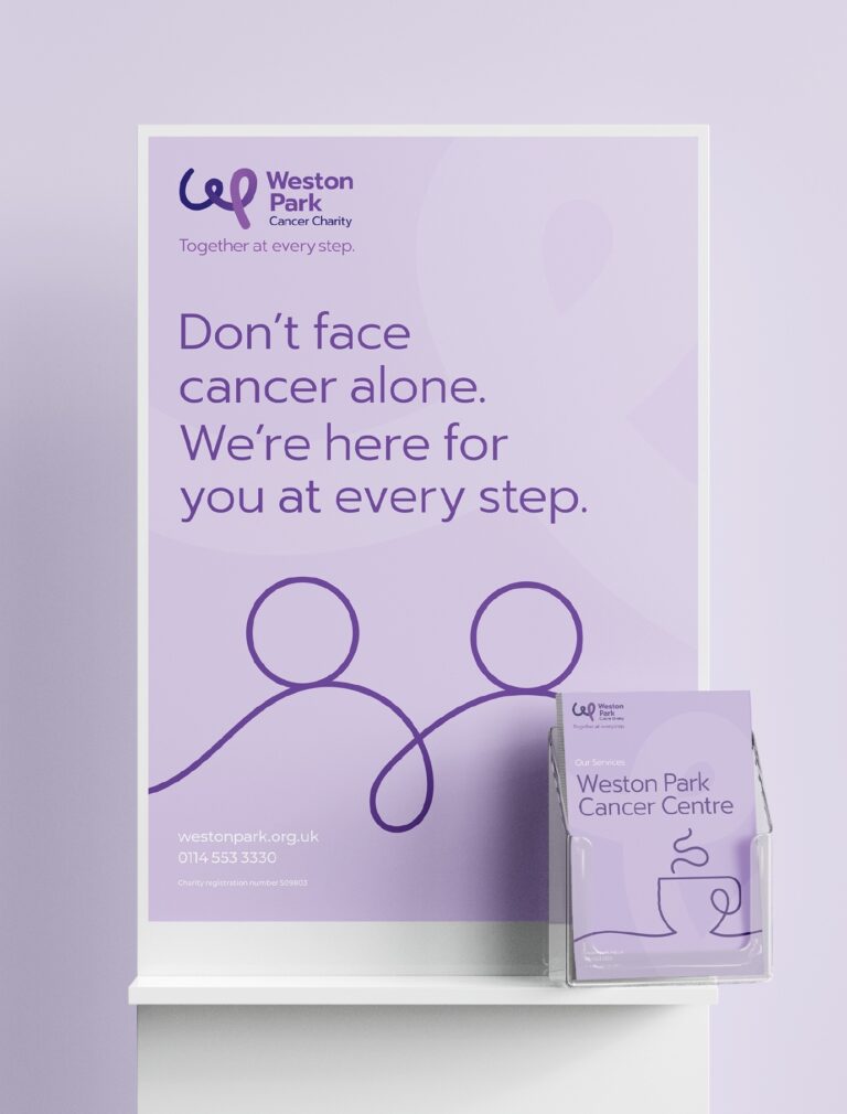
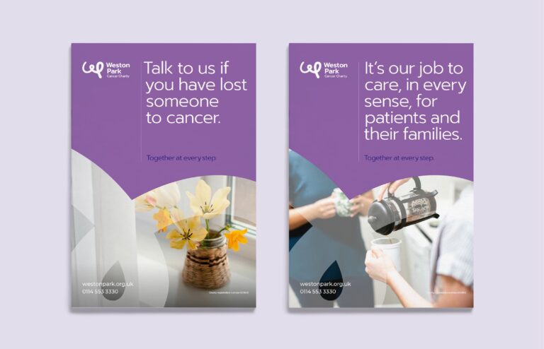
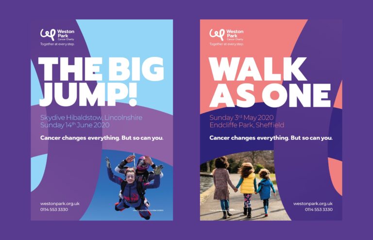
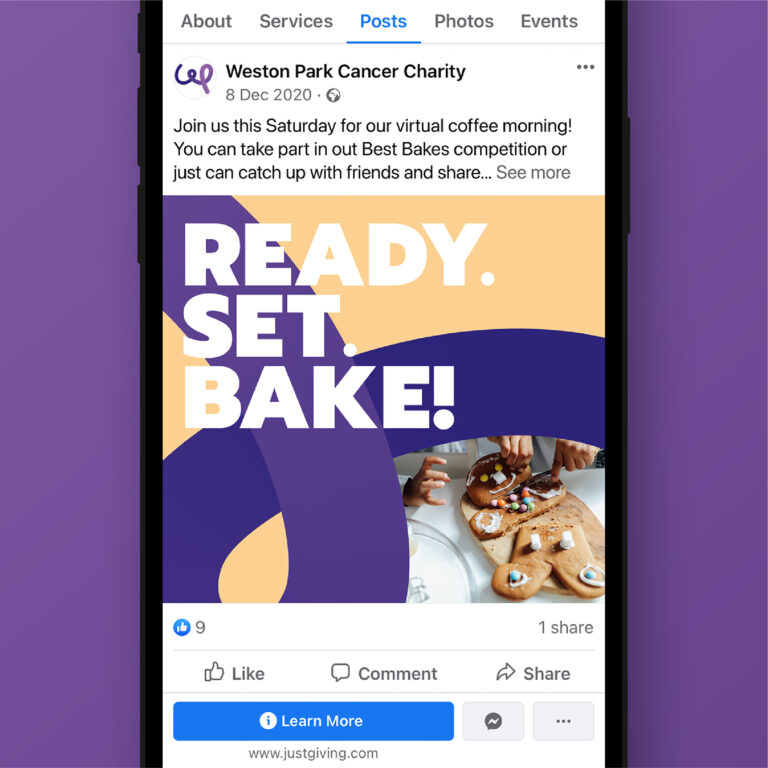
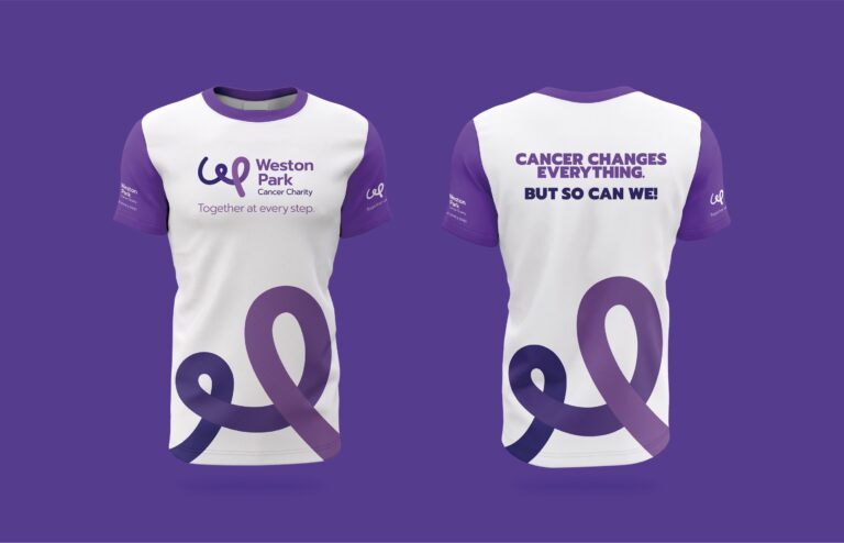
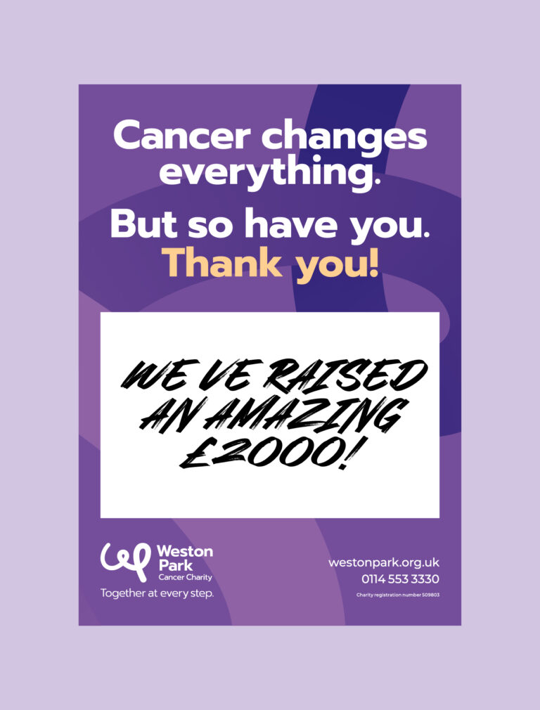
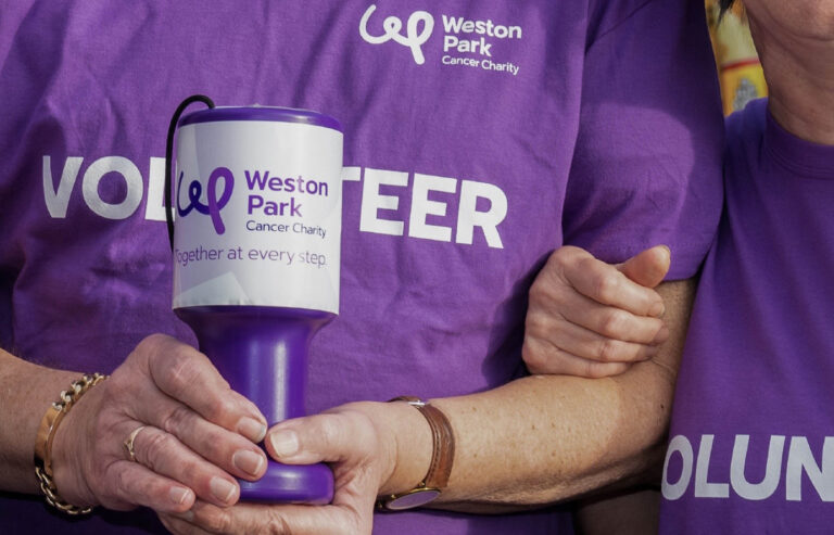
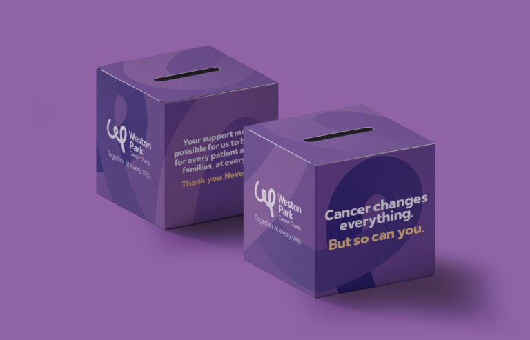
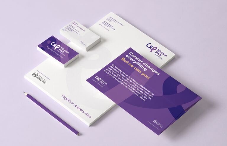
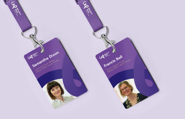
Our approach to the design of the brand was to provide range and versatility. We chose Prompt as the lead typeface, as it had the characteristics and choice of weights needed for the different communications the charity would produce; from big, bold and punchy fundraising material to clear and supportive patient information. We built on the recognition the charity already had with the colour purple, but expanded the palette to offer differentiation and suitability for different audiences and messages. We also created a brand motif. Derived from the logo, the motif can be used as an expressive graphic feature, a frame for images, or as a subtle watermark. All of these elements worked together to form a creative spectrum for the brand. Combined with the messaging pillars, this spectrum enabled the charity to adapt its appearance, tone of voice and choice of imagery to ensure that communications connected with the right audience.
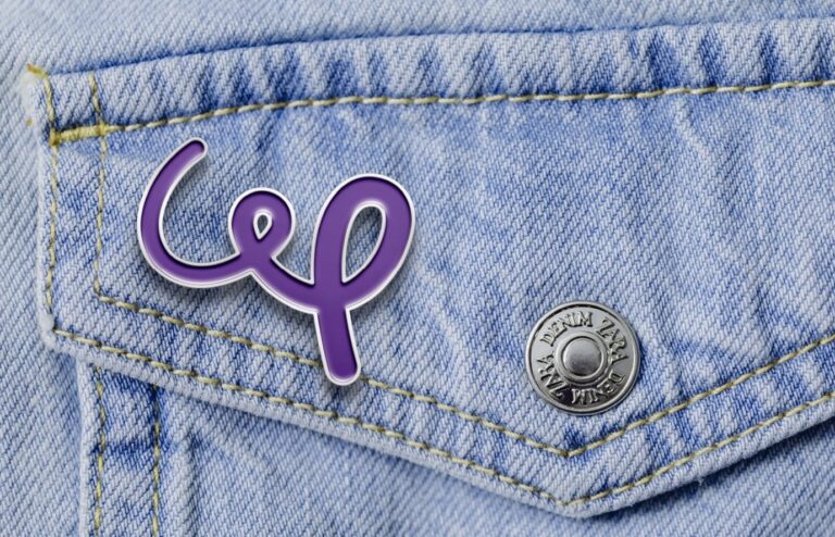
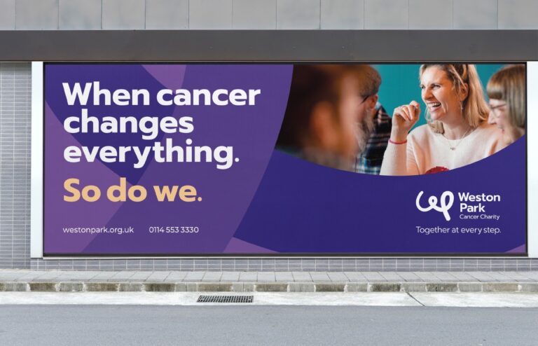
The logo itself had a more direct objective. Previous logos had often felt too abstract and disconnected from the charity. In contrast, the new logo puts the charity’s name front and centre with a distinct and positive monogram. The gradient used within the logo and the brand motif evokes the momentum and energy of the charity’s work. It suggests that life with and beyond cancer is a journey, and Weston Park Cancer Charity is there at every step.
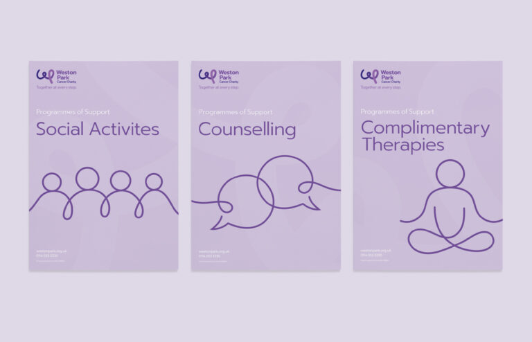
The movement and energy of the logo also shaped a series of illustrations. These would feature on various patient services materials and in an animated video that led the brand launch; expressing the core services and ambitions of the charity.
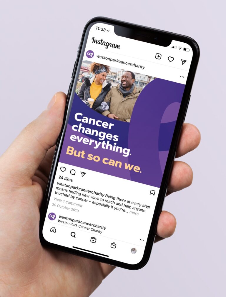
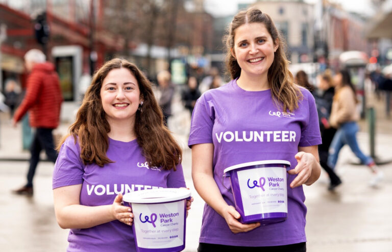
Fundraising remains a vital part of communications. To focus campaigns and fundraising initiatives we developed a hard-hitting and adaptable lead message that could both inspire people to get involved or show gratitude for the fundraising efforts and donations people made.
The brand was rolled out across a huge range of communications and marketing material. It has reinvigorated the charity and given staff renewed confidence to inspire, guide, support and care for people through their journey with and beyond cancer.
CEO (former) of the charity Sam Dixon has this to say about the process.
“Putting your organisation’s brand in the hands of a third party is quite a stressful proposition but our fears were soon allayed by Cafeteria. Throughout the process we were impressed by the professionalism, curiosity, and understanding exhibited by the team. The approach taken by Cafeteria was just what we were looking for — they listened to us, challenged us, and, in so doing came up with a focused and confident rebrand, reflecting our values and speaking to our many stakeholders.”