What was involved:
- Brand Strategy
- Visual Identity
- Space
- Interpretation

The Green Estate is a Community Interest Company (CIC) based on the Manor estate in Sheffield. Once labelled ‘the worst estate in Britain’, the organisation has been instrumental in the regeneration of the Manor through the improvement of surrounding green spaces and community support initiatives.
After 20 years of local regeneration, the founder and outgoing CEO needed a way to cement all the learning of the past two decades into a focused, resilient, and most of all, unified strategy to enable The Green Estate to look beyond their postcode and demonstrate to the world what successful urban nature can look like.


The challenge The Green Estate had was that whilst individual facets of the organisation were operationally successful, their collective offer was fractured. This resulted in crucial messages being expressed “in a bewildering number of voices” and The Green Estate as the organisation responsible was often lost in terms of audience awareness.
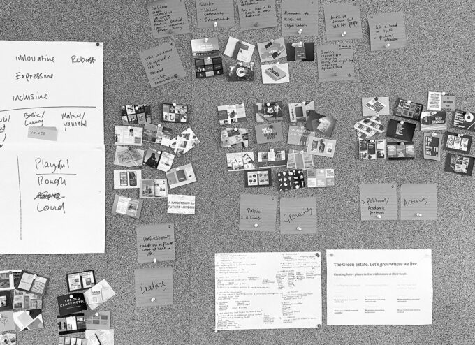
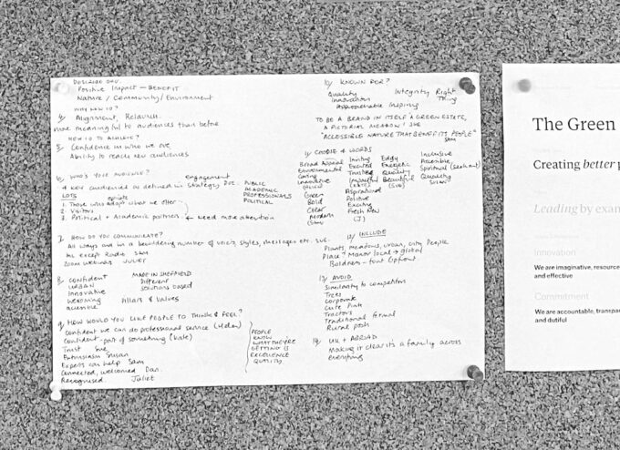
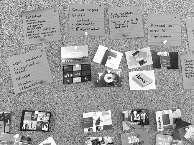
Our consultation workshops with staff and key stakeholders revealed complex organisational relationships but a strong desire between colleagues to share knowledge and close gaps. Common values began to emerge alongside a mutual need to showcase their ideas for ‘future nature’ to businesses and professionals, engage local communities with beautiful green spaces, and make an impact with policymakers to mainstream nature into our cities.
We defined a communications strategy for The Green Estate that provides a framework for their ‘Future Nature’ story. Core messages of Leading by example, Growing together, and Acting now for a better future work to inspire, encourage and engender confidence in The Green Estate.
Stepping past any ecology or climate jargon and emphasising the societal impact of The Green Estate’s work, we established their collective purpose; To create better places to live with nature at their heart. This idea cuts to what matters and connects everyone within and outside the organisation to a common goal.
The visual identity is made up of three brand expressions that channel The Green Estate’s core messages, values and behaviours. Each expression has a distinct style and tone, which allows them to effectively adapt their communications to different audiences.
All three expressions are unified by a lead typeface and shared colour palette. Roc Grotesk provides the visual variety to be serious and refined for professional service material and bold and playful for visitor interpretation. Colour combinations from the brand palette can be clear and simple for day-to-day applications or vibrant and punchy for campaign purposes.


The Green Estate logo — affectionally nicknamed the ‘Northern Flower House’ — encapsulates the call to action of the brand “Let’s grow where we live”. It is a warm and welcoming symbol, offering an open invitation for anyone to make a positive difference on their doorstep.
The brand is a cross-pollination of The Green Estates’ people and purpose. It provides the individual expression needed to communicate the range of their work but unites everything with a shared visual confidence.


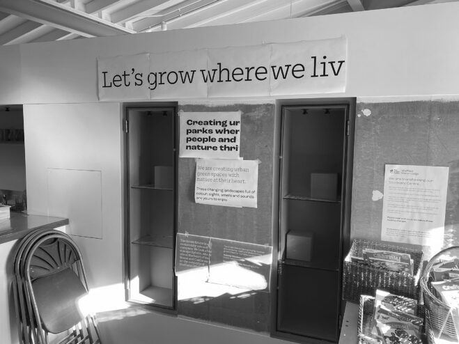
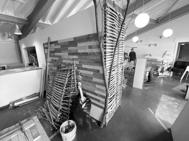
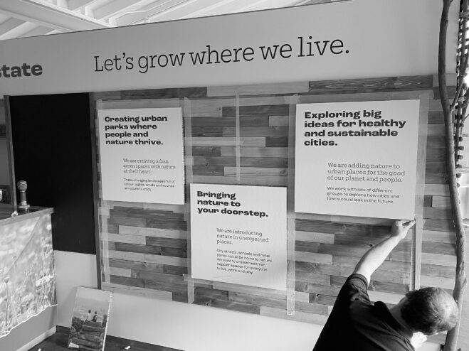
The initial implementation of the brand was at The Green Estate’s discovery centre. We partnered with the visitor experience team to create the ‘Future Nature Lab’, a co-creation space to engage with local community groups, schools and universities and other climate-focused organisations.


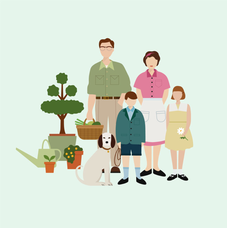
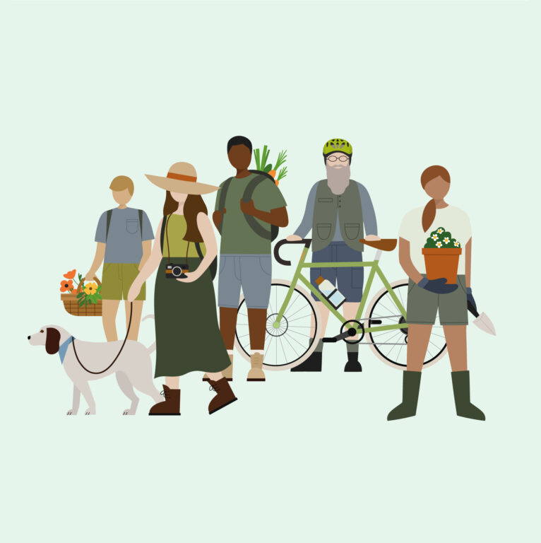
We produced a series of interpretative displays, ranging from a formal overview of The Green Estate’s mission to more self-led prompts and provocations.
This was a vital launching point for the new brand, presenting The Green Estate as a place that is resolute, receptive and responsive to the needs of people and the nature around them.
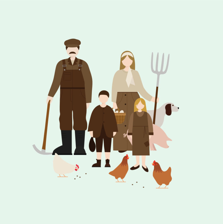
Illustrations created by Sarah Abbott


After many years, The Green Estate team felt like they had found the right words and the right visual that had previously eluded them. This only happened because they rose to the challenge brilliantly and Cafeteria responded with painstaking care and craft to deliver a strategy and identity that could work in any and all of their applications.
Behind the project
