Latest project story
The Green Estate
The Green Estate


Our brand strategy defined the primary work areas of the charity as providing support, enabling research, enhancing treatment and caring in every sense. These core messaging pillars allow the charity to channel its communications, and for the first time build a connection with the amazing stories it has to tell.

Our approach to the design of the brand was to provide range and expression. The lead typeface has the characteristics and choice of weights needed for the different communications the charity produces. The colour palette offers differentiation and suitability for different audiences and messages. And a brand motif was created as an expressive graphic feature.

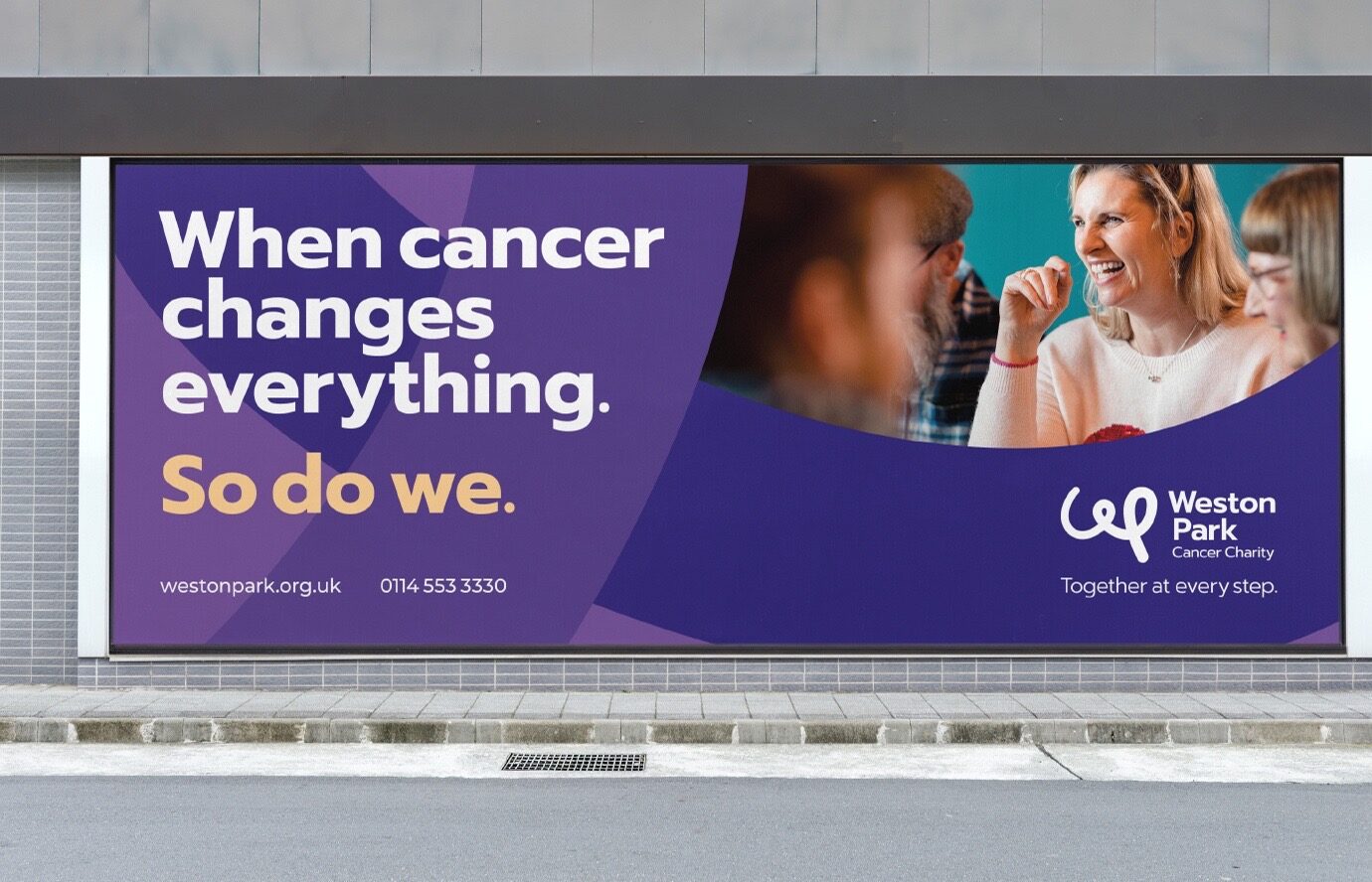
The new logo puts the charity’s name front and centre with a distinct and positive monogram. The gradient used within the logo and the brand motif evokes the momentum and energy of the charity’s work. It suggests that life with and beyond cancer is a journey, and Weston Park Cancer Charity is there at every step.


All of these elements work together to form a creative spectrum for the brand. Combined with the messaging pillars, this spectrum enables the charity to adapt its appearance, tone of voice and choice of imagery to ensure that communications connect with the right audience.


The movement and energy of the logo also shaped a series of illustrations. These feature on various patient services materials and in an animated video that led the brand launch; expressing the core services and ambitions of the charity.


Fundraising remains a vital part of the charity’s communications. To focus its campaigns and fundraising initiatives we developed a hard-hitting and adaptable lead message that could both inspire people to get involved or show gratitude for the fundraising efforts and donations people make.


The brand was rolled out across a huge range of communications and marketing material. It has reinvigorated the charity and given staff renewed confidence to inspire, guide, support and care for people through their journey with and beyond cancer.


“Putting your organisation’s brand in the hands of a third party is quite a stressful proposition but our fears were soon allayed by Cafeteria. Throughout the process we were impressed by the professionalism, curiosity, and understanding exhibited by the team. The approach taken by Cafeteria was just what we were looking for — they listened to us, challenged us, and, in so doing came up with a focused and confident rebrand, reflecting our values and speaking to our many stakeholders.”


