What was involved:
- Brand Strategy
- Visual Identity
- Marketing Communications
- Animation


The big idea is defined by three core pillars: the unique experience live theatre provides, the skill and passion that goes into the work they produce and the communities that are built around creating and enjoying theatre.
The strength of the new brand is in its assertiveness. Bold typography, vivid colour, and a distinct graphic flourish evoke the emotion and experience of live theatre. No matter where the logo appears it carries the passion and pride Sheffield Theatres wants to be recognised for.

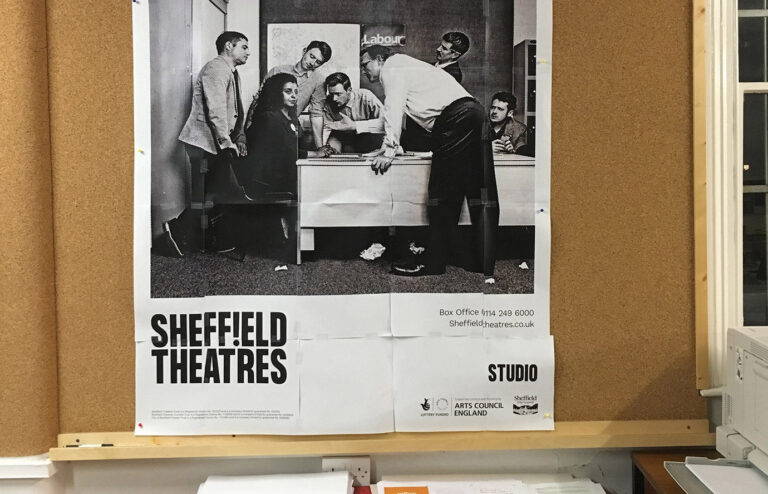
Show publicity is designed to be versatile and dynamic. Emphasis can be given to a well known title or to an expressive lead image that conveys the nature of the production. The layout is responsive, always finding the right balance of content.


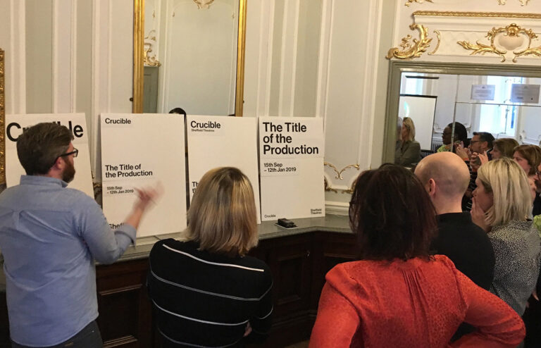
It was important for show publicity and the brand to feel integrated. Typography helps connect the show with the brand and colour allows the brand to embrace the look and feel of the show.


The presence and impact of the new brand has allowed Sheffield Theatres to take centre stage in their own story. The identity has been rolled out across multiple communication touchpoints, including season brochures, tickets, internal assets, and the new website.


We are so happy with our brand which perfectly captures the vibrancy and energy of our company. The team at Cafeteria really immersed themselves in our organisation and their partnership helped us to reconnect with who we are and what’s really important to us. The experience has been truly transformational and enormously enjoyable. Thank you!
Behind the project
