Latest project story
The Green Estate
The Green Estate
Sheffield Theatres has been creating home-grown, world-class productions for over 40 years at both the Crucible and Lyceum, and has built a diverse community of makers, performers, storytellers and audiences, right at the heart of the city.
When Cafeteria came on board in Autumn 2018 Sheffield Theatres were already planning major changes. There was the delivery of a new website driving the timescale, Robert Hastie’s first season as Artistic Director launched in 2017, and the organisation had been working on a strategic plan to take them to 2022. Ten years had passed since the theatre’s last rebrand and it was no longer keeping up with their ambitions.
Through a series of workshops with senior management and the wider theatres team, Cafeteria identified the challenges and opportunities the brand had to meet and understood the shared values that needed to be communicated.
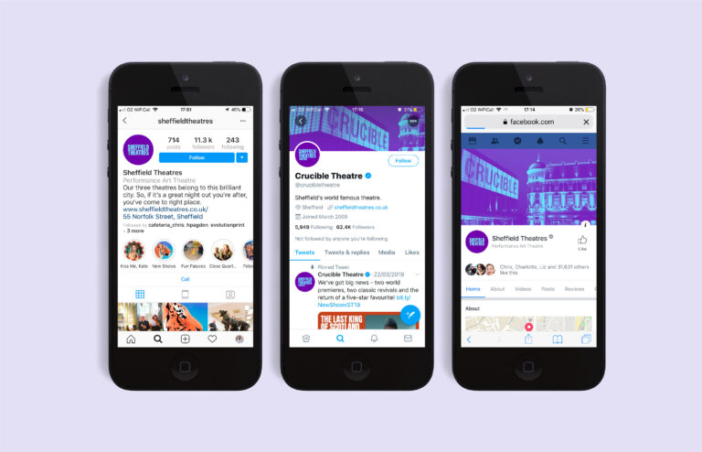
We found that audiences had a strong affinity with the Crucible and Lyceum buildings but failed to see the organisation behind them. This restricted the theatre’s ability to express themselves beyond the publicity of a given show.
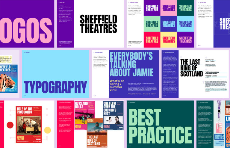
But even on show publicity the presence of the organisation had become lost in the noise. The logo had little presence on visiting production’s publicity, and in-house productions relied solely on a lead image rather than a complete and consistent brand package.
Together we drew out a compelling brand story for Sheffield Theatres. One that resonated with staff across the organisation, provided a platform for building the brand over the next three years, and drove the visual style of the new identity.
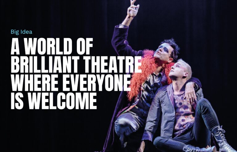
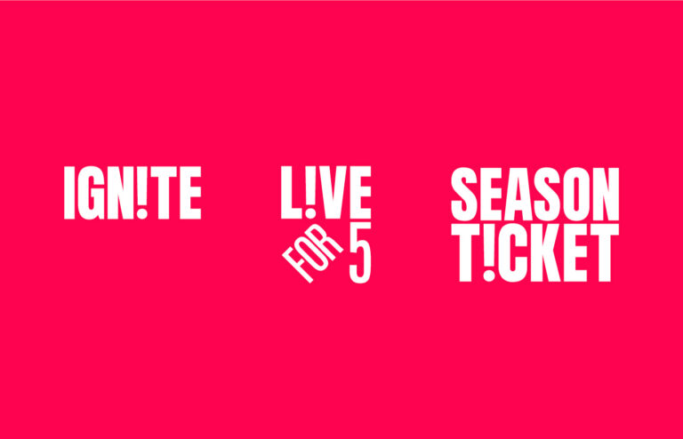
We started with the big idea of ‘A world of brilliant theatre where everyone is welcome’. This idea is defined by three core pillars: the unique experience live theatre provides, the skill and passion that goes into the work they produce, and the communities that are built around creating and enjoying theatre.
The values of the brand shape how it looks and how it behaves — bold, fun, exciting and engaging. We made a brand to entertain, inspire, enlighten and challenge. A brand that brings excitement, magic and emotion. A brand that is proud and warm and welcomes everyone. A brand with a simple promise of ‘a good night out’.
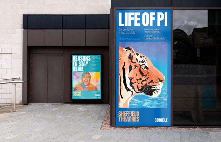
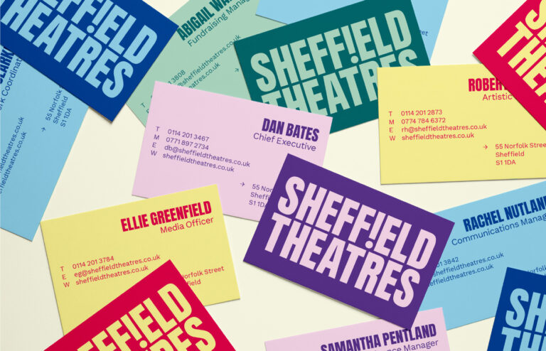
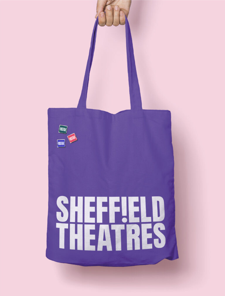
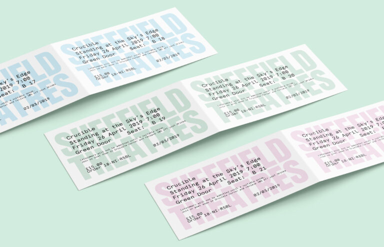
The strength of the new brand is in its assertiveness. Bold typography, vivid colour, and a distinct graphic flourish evoke the emotion and experience of live theatre. No matter where the logo appears it carries the passion and pride Sheffield Theatres wants to be recognised for.
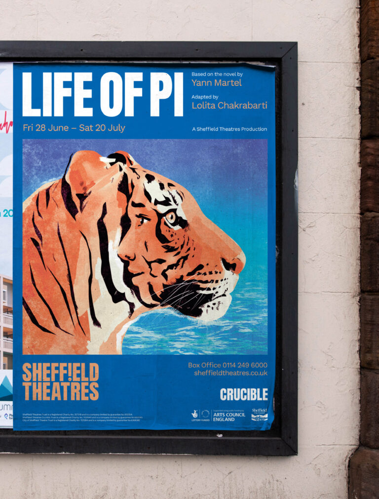
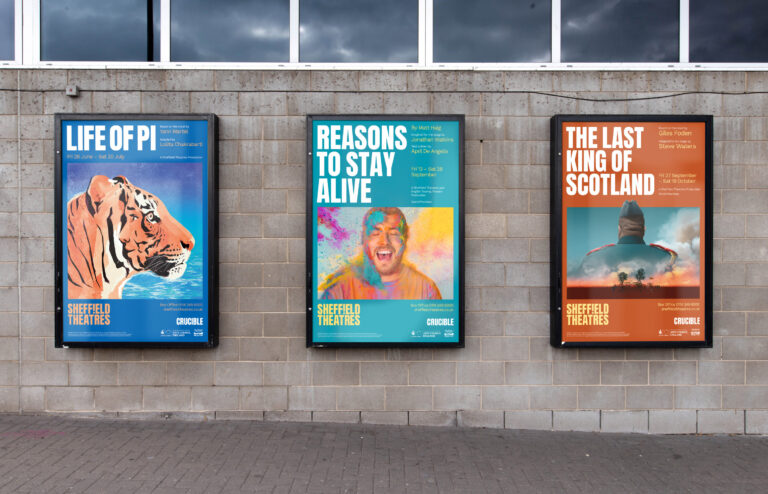
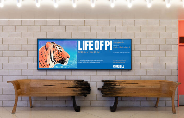
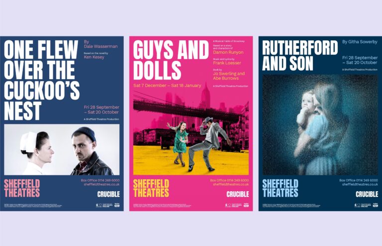
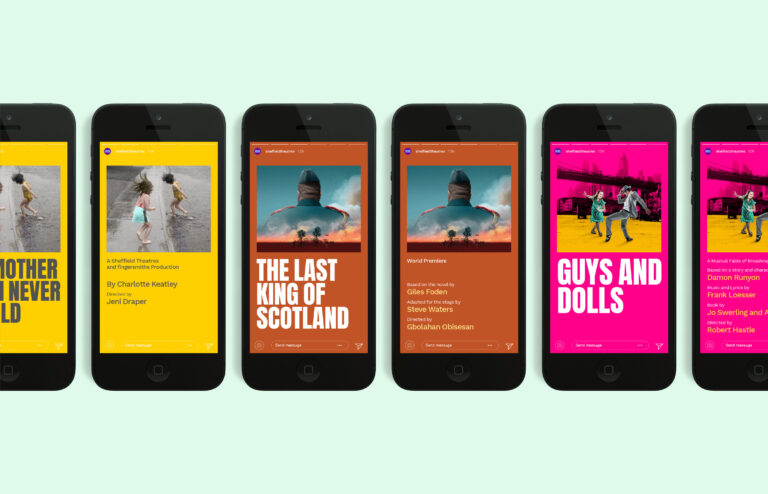
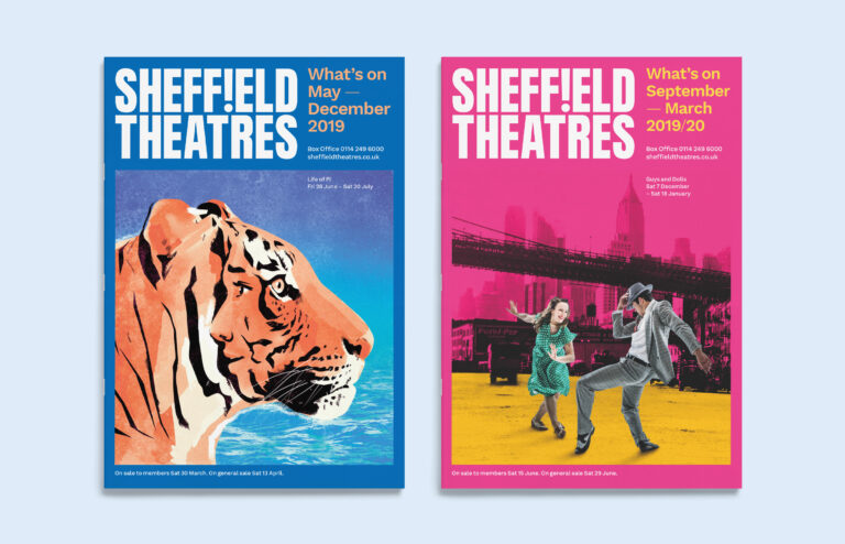
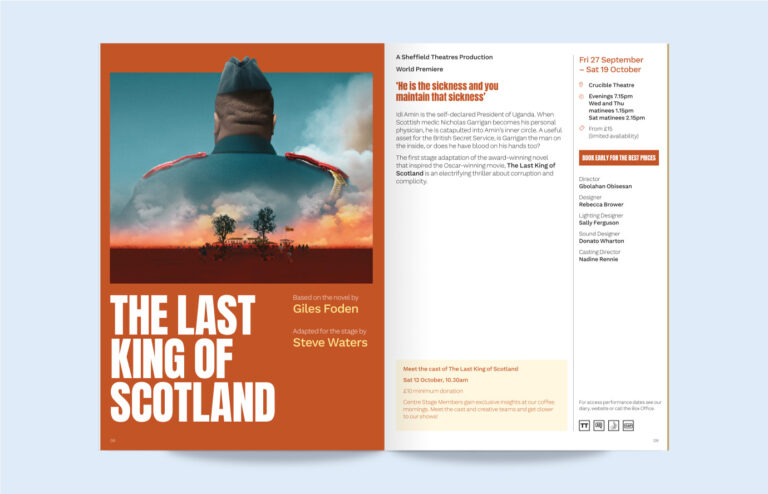
Show publicity is designed to be versatile and dynamic. Emphasis can be given to a well known title or to an expressive lead image that conveys the nature of the production. The layout is responsive, always finding the right balance of content.
It was important for show publicity and the brand to feel integrated. Typography helps connect the show with the brand and colour allows the brand to embrace the look and feel of the show. This flexibility in the design allows every show to be distinct but ensures that homegrown Sheffield Theatres Productions are uniquely recognisable.
The presence and impact of the new brand has allowed Sheffield Theatres to take centre stage in their own story. The identity has been rolled out across multiple communication touchpoints, including season brochures, tickets, internal assets, and the new website designed and built by Supercool.