What was involved:
- Wayfinding
- Environmental Graphics
- Planning
- Strategy

Photograph © Jill Tate


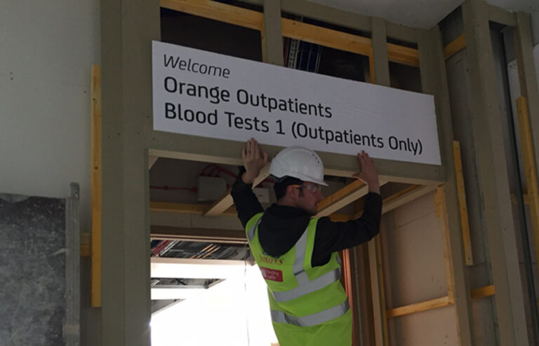
We introduced a simple wayfinding strategy to refine journeys throughout the old building and seamlessly connect them into an award-winning new wing.


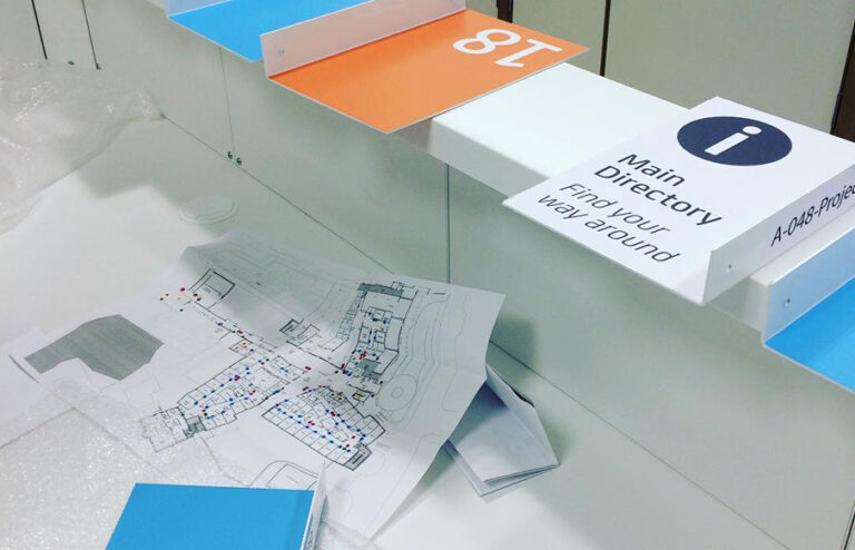
We rationalised hundreds of signs and designed a modular system with just three directional sign types. By generating a searchable database, we empowered hospital teams to manage signage revisions internally.


We simplified terminology, introduced an alphabetical hierarchy and set type according to cardinal directions to improve navigation and enhance visitor experience.


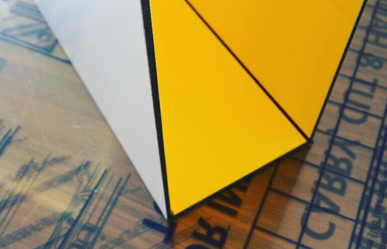
Signs are sympathetic without being decorative. We opted for a geometric, highly legible typeface with slightly rounded edges. The suite of icons complement both the typography and the architecture. The colour palette is bright and balanced, complete with a neutral for setting type.


From fantastical illustrations, to acrylic donor plaques and vinyl modesty screens, environmental graphics are colourful, imaginative and engaging.


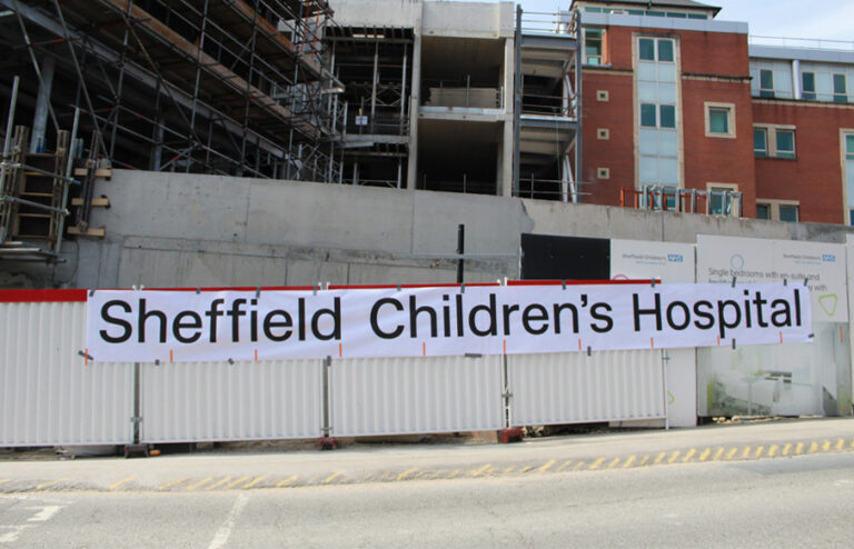
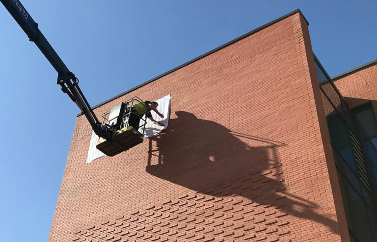
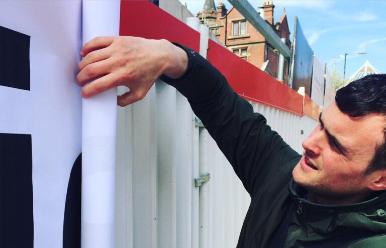
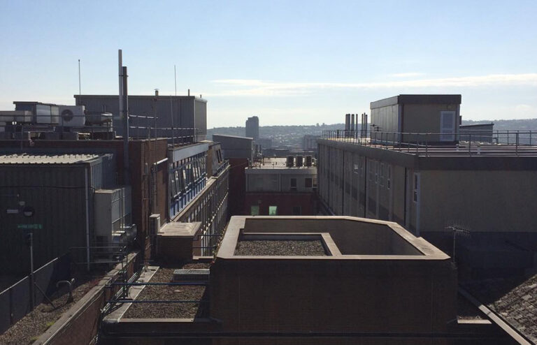
Exterior signs are bold, familiar and timeless. We opted for a typeface widely used across civic institutions in the 1960s, acknowledging its place in the public consciousness.


My daughter is a regular visitor to Sheffield Children’s Hospital. She has Asperger’s so is acutely aware of changes in the spaces around her, from light levels to a move of furniture. The new hospital wing has really improved our visits as the wide corridors, neutral décor and overall lack of clutter really help to keep her calm. Before there were so many signs and the corridors felt quite chaotic, but the new signage makes finding our way around so much easier. The impact this has on our day really can’t be underestimated.
Behind the project
