Latest project story
The Green Estate
The Green Estate

Photograph © Jill Tate
Managed by the Sheffield Children’s NHS Foundation Trust, the hospital is home to life-changing paediatric care, world-leading research facilities and an invaluable Emergency Department. There’s barely a family in the city who won’t have passed through its doors at some time.
Sheffield is one of just four specialist hospitals dedicated to children in the country, alongside Great Ormond Street, Alder Hey and Birmingham. Founded in 1876, it opened in its current location on Western Bank in 1878, first existing as a pair of semi-detached houses. As demand grew, two new wards were built in 1927 and another in 1930. An operating theatre was added in the 50s and the Emergency Department was introduced in the 70s, with further additions throughout the 90s. Having over a century of architectural adaptation under one roof presents a long list of challenges and by the early noughties both staff and patients were struggling to navigate the rabbit warren of lifts, stairwells and corridors.
In 2009 Cafeteria was commissioned to audit and write a report on the in-situ signage in order to identify where it was failing, then introduce environmental graphics as a means to fix it. However, it was clear from the outset that decorative corridor trails would only ever be a reaction to a problem and never a full solution — the deep-rooted issue was with the lack of a holistic Wayfinding system.
To figure out and design such a system for this complex, ever-evolving environment required multi-layered, objective-driven research and solid project management. Cafeteria began by consulting all levels of staff, from hospital porters to directors, as well the parents of patients. We carried out countless site audits and conducted workshops with an internal steering group every two weeks for six months. Our overarching discovery was a simple one — communication is critical.
Maintaining interdepartmental communication can be challenging for large-scale institutions such as hospitals. For example, at SCH, we identified that patient’s families were being instructed to arrive for appointments at 7:30am, even though porters didn’t unlock the main entrance until 8am, forcing patients to access the hospital through the Emergency Department. Cafeteria also identified that the patient journey often begins prior to arriving at the hospital; for many it begins at home with an NHS appointment letter. We used this letter as a springboard to challenge the hospital’s use of language, a long-standing staff concern. Not only does the written terminology need to marry with the terminology used across hospital signage, it also needs to be easily understood by a wide demographic. ‘Radiology’ versus ‘X-Ray’? ‘Ophthalmology’ or ‘Eye Department’? Latin names and technical terms are relevant within the medical community, but Cafeteria understood the power of simplifying language in order to improve public accessibility.
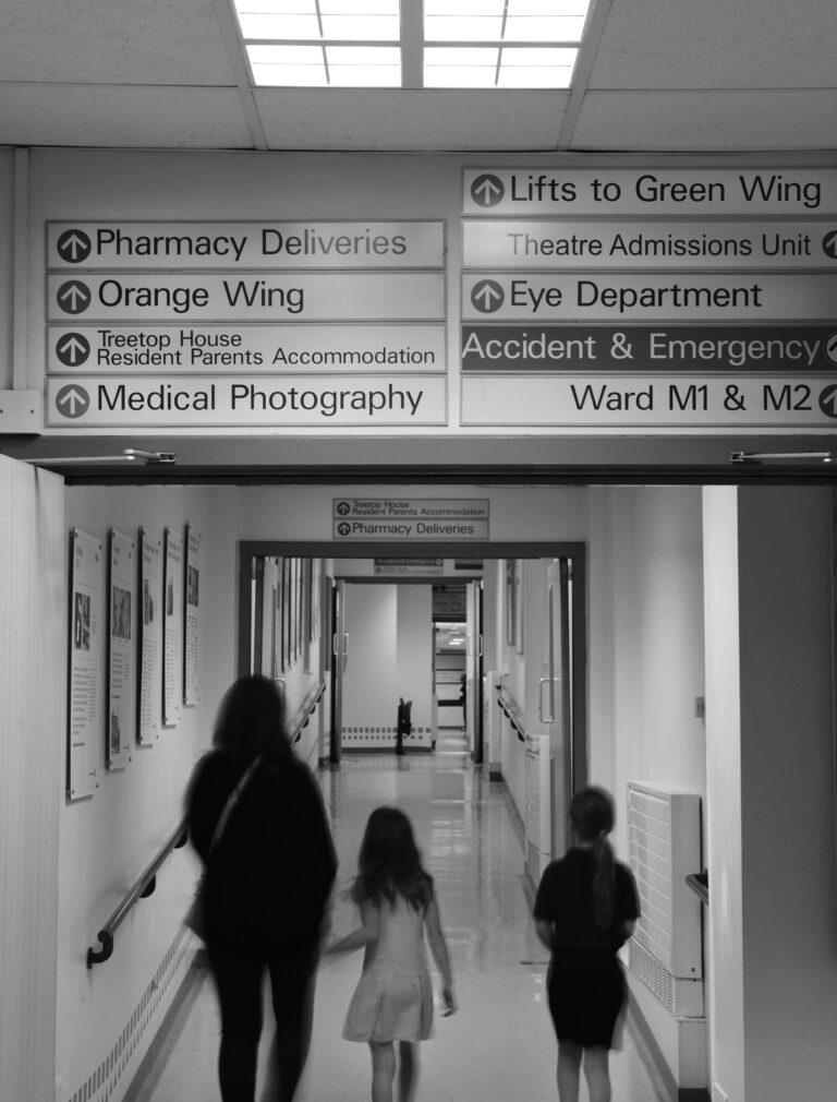
Our in-depth audit of directional signage found it to be overly complex. Signs tended to list every location at every opportunity, making orientation difficult. We also discovered that if one sign was changed, any associated signs were not considered. At best, this led to parents having to seek guidance from passing members of staff. At worst, this meant having up to thirteen signs on one wall, complete with an instructional sign on how to use the other signs, making for a stressful visitor experience.
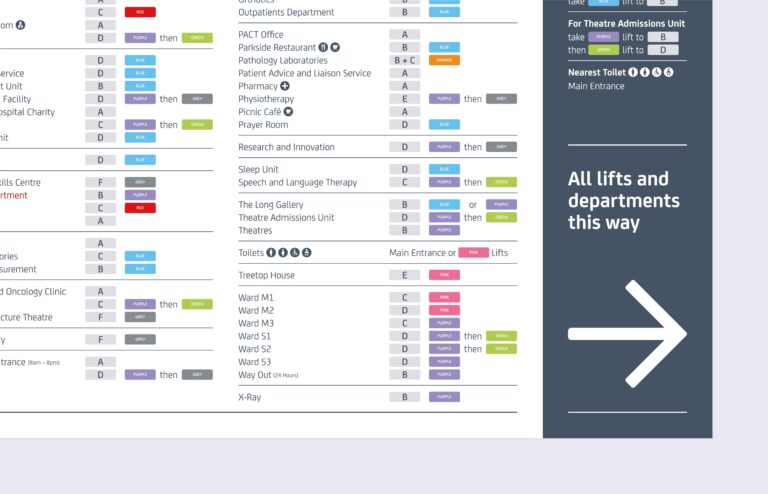
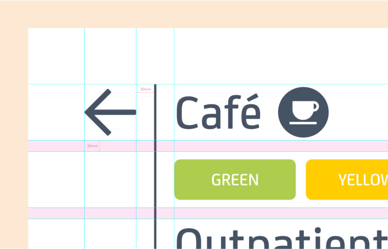
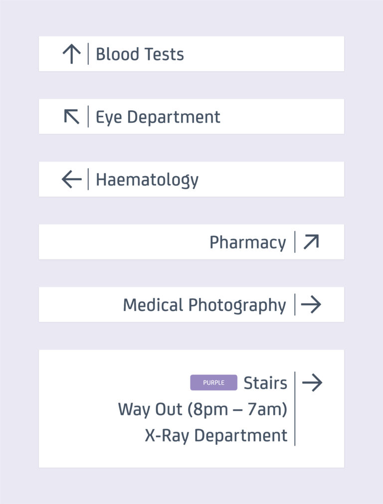
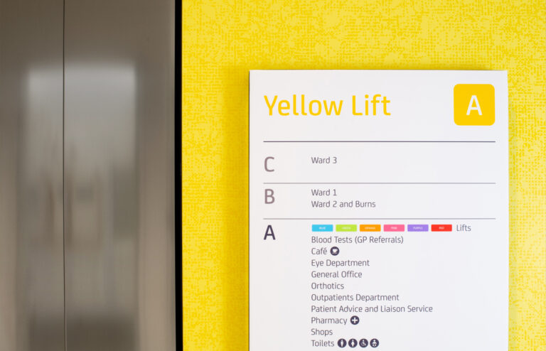
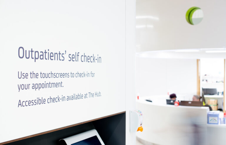
We began solving these issues by introducing a strategy to map key journeys, breaking them down into four simple steps; Orientate (Where am I?), Inform (Okay, where do I need to get to?), Direct (Which way do I go to get there?), and Identify (Yes, I’m where I need to be). This strategy allowed us to design a modular system, reducing directional signs to just three sign types; six-line, three-line and single-line signs: that were easy and cost effective to manufacture, being made up of a minimal number of components. We also created a searchable database, numbering, mapping and cataloguing every sign, so that internal teams could easily amend signs when necessary and identify which other signs would stop making sense if revised independently of one another.
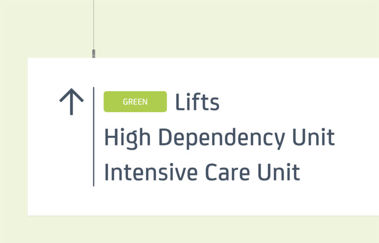
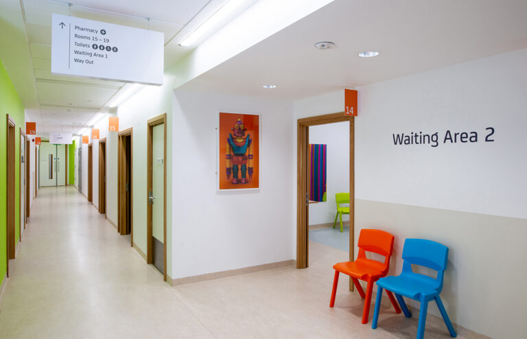
In 2012, Sheffield Children’s Hospital announced plans to extend the hospital as part of a £40 million project and appointed London-based architects Avanti. This extension was to introduce three new wards, en suite bedrooms, a new outpatient department, a children’s play area and a disabled access car park. Working in close-partnership we seamlessly extended our strategy and Wayfinding system for the older building into Avanti’s plans for the new. By colour-coding ‘cores’, or lifts, we were able to further refine journeys to ‘in, up and across’. On entering the building a sign confirms your current location, a multi-level directory lists all possible locations, a number of directional signs guide you along the way and another sign identifies your destination. Cafeteria realised that directing visitors to a core would actually get them to the correct floor and, from there, to the relevant department, ward or consulting room with relative ease.
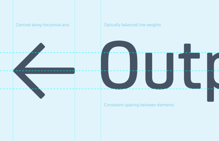
With our Wayfinding system in place, there were a number of design considerations. Whilst we felt strongly that signage should not be decorative, our choice of typeface was sympathetic to the environment. We opted for FS Joey, a geometric, highly legible font with slightly rounded edges to soften the clinical spaces. We typeset locations with arrows following the Cardinal points of north, east and west, with the alignment of text left or right acting as a signifier of direction. We adopted an alphabetical hierarchy, meaning that locations remained in relative positions across multiple signs, with ‘Emergency Department’ as the one exception to the rule — always sitting in red at the top to signify its importance. We also designed a suite of icons to visually support information.
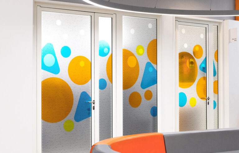
In addition to Wayfinding, Cafeteria worked in close collaboration with Artfelt, the creative arm of The Children’s Hospital Charity, to produce and deliver a number of imaginative and engaging environmental graphics for children to enjoy. From modesty screen panels in bold, colourful shapes and tessellating patterns to commissioning illustrator Tatiana Boyko to depict fantastical adventures for lift interiors.
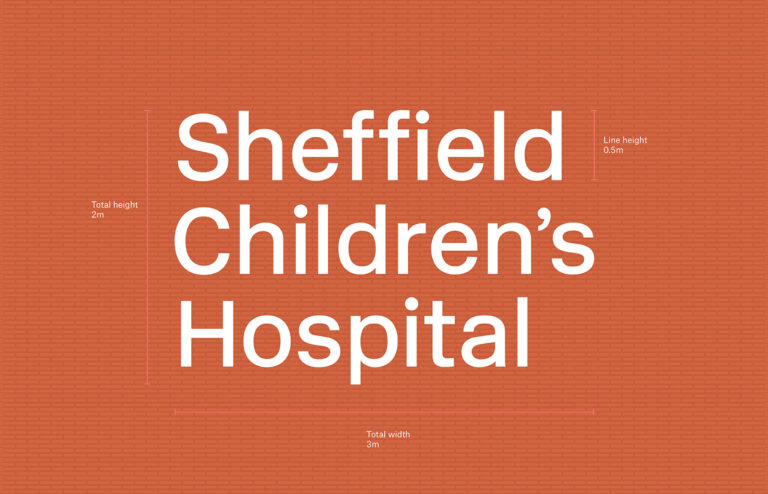
Avanti also consulted Cafeteria on a suitable typeface for the exterior of the new building. We opted for New Rail Alphabet, a revival of the British Rail Alphabet designed by Margaret Calvert in the 1960s, which was widely used across everything from train stations to hospitals and civic institutions. We felt it was already embedded in the public consciousness and so held the quality of timelessness we were looking for. ‘Sheffield Children’s Hospital’ was set in this typeface on two main assets — a powder-coated steel sign, mounted to the side of the brick facade and a 15-metre-long concrete wall adjacent to the road. We also used New Rail Alphabet for a memorial plaque, set into the wall outside the main entrance. The type was laser-cut from a concrete cast and poured in brown resin, the weight of the materials used suggestive of this buildings’ important legacy for future generations.