What was involved:
- Exhibition
- Marketing Communications


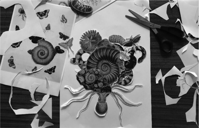
Using a study of a fossil as the central anchor, we juxtaposed a variety of creatures to form an ornate and other-worldly composition. Layered together, the creatures overlap, camouflage or interact with one another, creating a sense of motion and evoking a state of wonderment.


The graphic we created for Art & Wonder encapsulates the essence of the exhibition while remaining flexible and scalable for application across a variety of marketing formats, both print and digital.


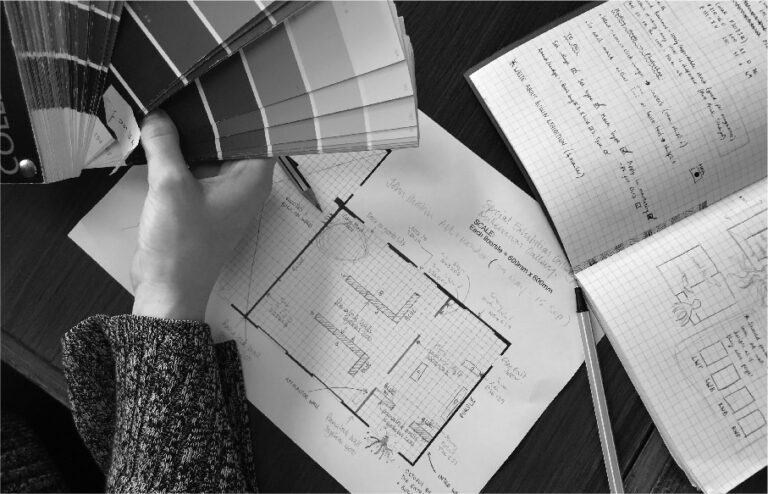
Due to the sensitive nature of many of the works on show, light levels had to be dimmed making the choice of colour all the more important. A palette of purple and blue was chosen for the walls with a soft parchment colour providing contrast for interpretation labels.


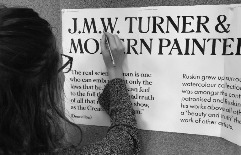
The layout of the exhibition was divided into thematic sections and styled using an ornate and calligraphic typeface evocative of the Victorian era during which Ruskin lived and worked.


The high praise from partners, stakeholders and visitors alike, as well as press, saw the lead graphic applied to merchandise to sit alongside the book we designed back in 2012 in the gallery shop.


The resulting audience experience of the exhibition is as if wandering through the inner workings of John Ruskin’s mind.
Conveying a sense of spectacle was at the core of the design brief for the exhibition; the identity that Cafeteria developed for us couldn’t have met that brief more perfectly. The designs they created present the historical collection images in a way that felt like you were seeing them anew – but more than that, they truly captured that sense of wonder you feel when you see those artworks and the amazing natural phenomena they depict. We’ve had lots of great feedback on the design and I’m sure Ruskin would have approved too.
Behind the project


