Latest project story
The Green Estate
The Green Estate

Museums Sheffield is the charity responsible for three of the city’s most long-standing art venues; Millennium Galleries, Graves Gallery and Weston Park Museum. Cafeteria has been working with Museums Sheffield since 2005, partnering with them to create countless exhibitions and deliver a vast range of marketing print, as well as environmental graphics and wayfinding systems.
To mark the 200th anniversary of the birth of highly influential Victorian artist, critic and scholar, John Ruskin, Museums Sheffield embarked on a major exhibition to celebrate his life’s work and philosophy. The exhibition was developed in partnership with the Guild of St George, the utopian body first established by Ruskin in 1871, today a registered charity and education trust working to put his wide-ranging ideas into practice. Having designed a book about John Ruskin for the same partnership in 2012, Cafeteria were appointed to design and deliver a full visual identity for the new exhibition – John Ruskin: Art & Wonder – that could be applied across all interior graphics and associated marketing collateral.
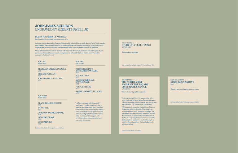
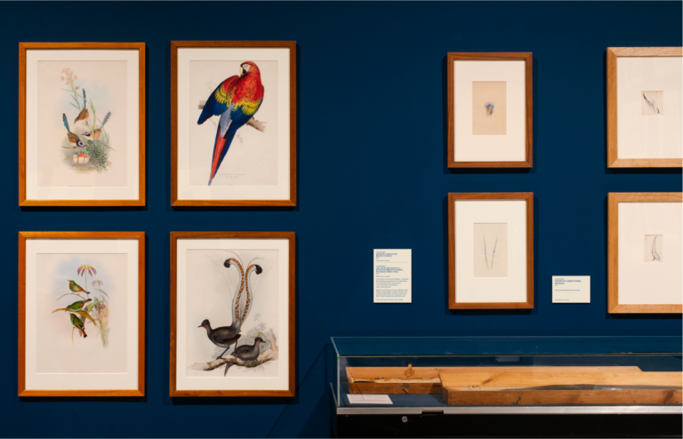
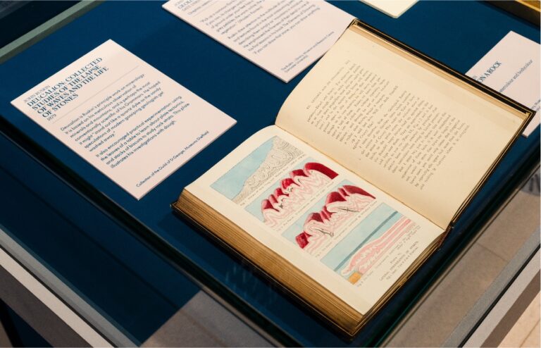
From initial meetings with the curatorial team we understood that Art & Wonder was to be an immersive exhibition of studies, works and artefacts from the natural world, harmonising with Ruskin’s belief that an understanding and appreciation of nature has the power to enrich lives and is just as valuable as any scientific knowledge. Though primarily consisting of drawings and paintings by fine artists, including Masters such as Turner, the show also comprised of contemporary works, including ceramics by Tania Kovats, 3D digital models by photographer Dan Holdsworth and an oversized illustrated lampshade by Glaswegian design duo, Timorous Beasties. Due to such a wide range of works and with no single work or artist headlining the show, we reasoned that to market the exhibition with a single lead image would be the wrong approach. Through discussions with the team we discovered that a good number of the most vivid and detailed drawings were owned by the Museum or the Guild, being part of their well-established collections. This enabled us to work with an archival photographer to digitise the original works at high-resolution, opening up a whole world of design possibilities.
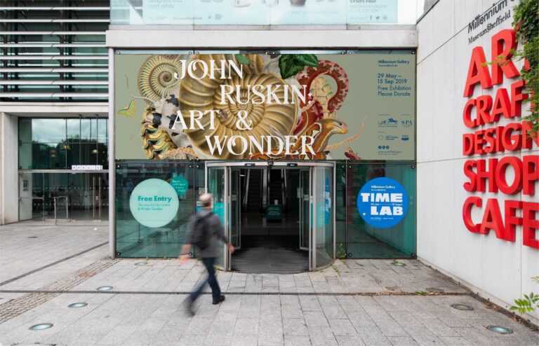
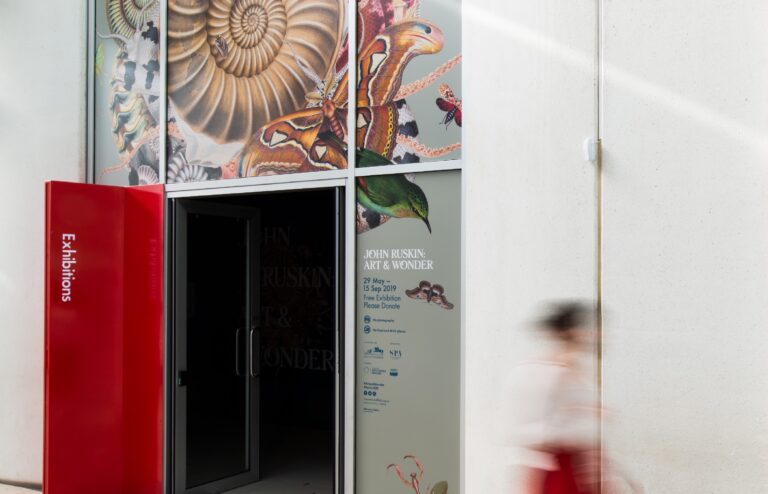
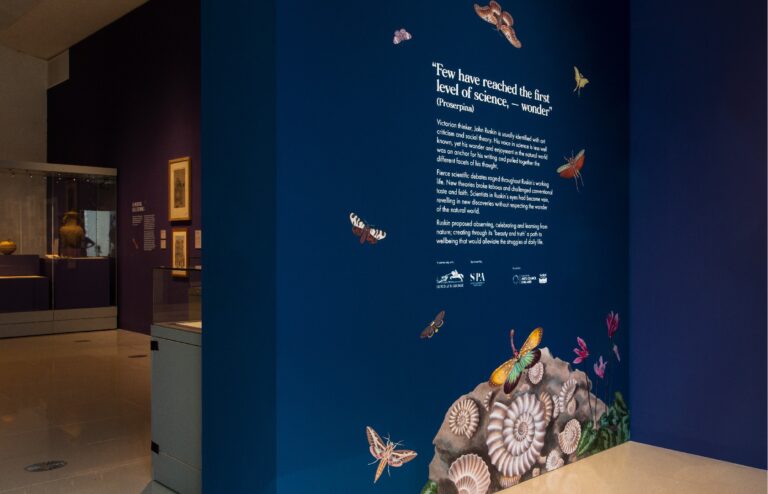
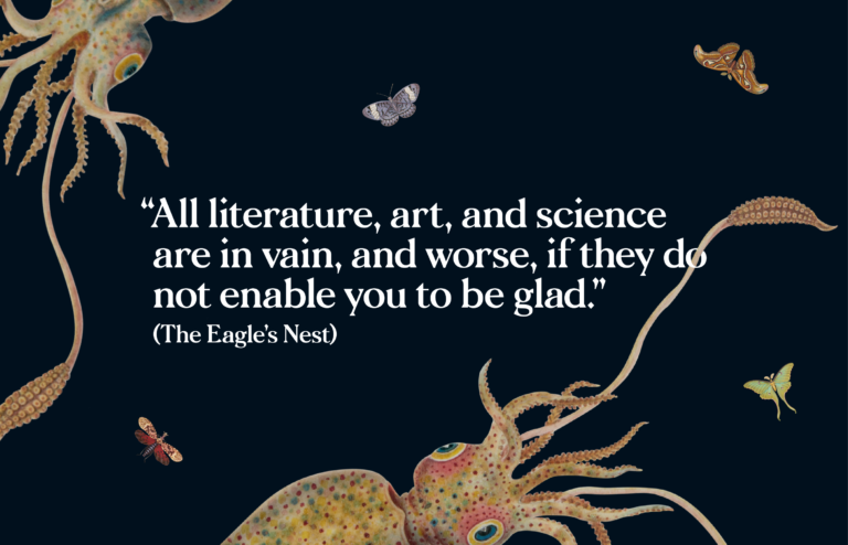
Taking the exhibition title at face value, we opted to painstakingly cut-out and collage a whole range of illustrations by contributing artists to create a colourful, vibrant and engaging lead graphic. Using Ruskin’s study of a fossil as the central anchor, we juxtaposed a variety of creatures to form an ornate and other-worldly composition. Layered together, the creatures overlap, camouflage or interact with one another, creating a sense of motion and evoking a state of wonderment.
Typography is key to maintaining the balance and control of the graphic composition. We opted for Morion, a contemporary typeface with an ornate, calligraphic style evocative of the Victorian era during which Ruskin lived and worked. The decorative wedge-shaped serifs and floral terminals, like the font’s alternate ‘O’, feel emblematic of Ruskin’s attention to detail in art, architecture and the natural world. The success of the lead graphic is in the seamless interweaving of type and image — the way a leaf falls behind the ‘K’, but over the top of the ‘I’ and the octopus tentacles knit their way through letters, such as the ‘W’ and ‘O’.
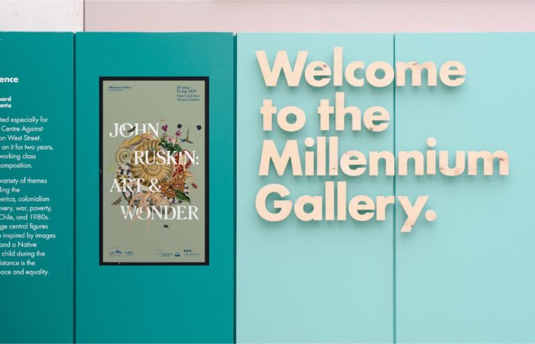
The graphic encapsulates the essence of the exhibition while remaining flexible for application across a variety of marketing formats, both print and digital. We successfully transposed the design across a suite of print collateral, from A5 invitations to A3 and paste-board size posters for a city-wide campaign. The design was scalable, moving from social media assets to outsize display graphics, installed above the Arundel Gate and Winter Garden entrances to the galleries, as well as the exhibition entrance itself. The collage-style also naturally lent itself to animation – insects crawling, birds hovering and tentacles swaying – that could be looped on plasma screens throughout Museums Sheffield.
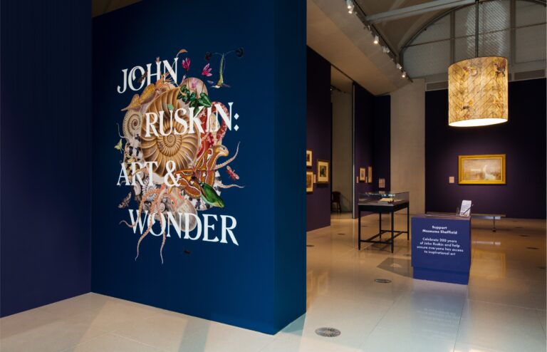
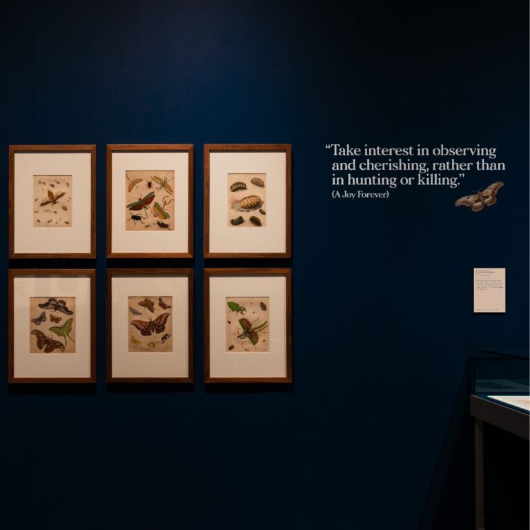
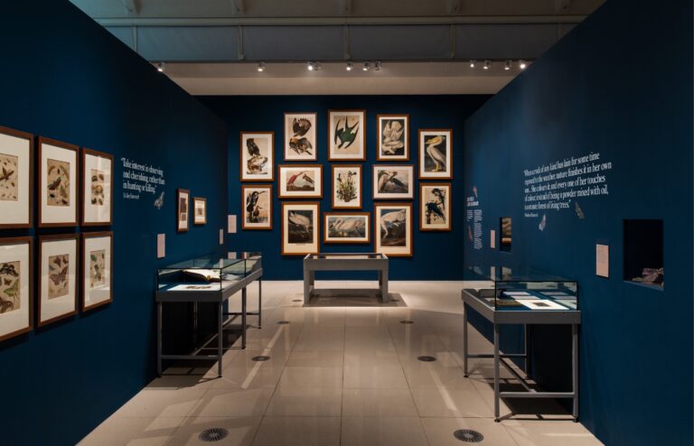
Beyond the assets necessary to market the exhibition, Cafeteria worked closely with the curatorial team to develop ideas and elevations for the gallery interior. Due to the sensitive nature of many of the works on show, light levels had to be dimmed making the choice of colour all the more important. Working together we agreed on a sympathetic, but rich palette of purple and blue. These were colours that Ruskin was particularly fond of, having written about them in specific relation to landscapes in a number of his published texts. For all accompanying object labels, on-gallery messaging and activity sheets we chose a neutral parchment, or off-white, colour that contrasted well with the dark walls.
The layout of the exhibition was divided into thematic sections, each consisting of an introductory text and wall-based pull-quotes. We set all titles and quotes in Morion, placing all supporting body copy in Futura as per Museum Sheffield’s established brand identity. Wanting to bring the character and expression of the lead graphic composition into the gallery, we installed contour-cut vinyl illustrations to a number of wall sections throughout the space, as well as to the floor across the threshold of the gallery entrance. Here, a giant octopus amongst a swarm of colourful creatures hooks the eye of passers-by, enticing them to venture inside to see more. Cafeteria was able to execute such super graphics working in close collaboration with a long-standing regional supplier, Signs Express.
The resulting audience experience of the exhibition is as if wandering through the inner workings of John Ruskin’s mind. The visual identity we created has received high praise from partners, stakeholders and visitors alike, as well as press. On receipt of such positive feedback, Museum Sheffield’s retail team requested artwork for application to merchandise to sit alongside the book we designed back in 2012 in the gallery shop.
Chris Harvey, Head of Communications at Museums Sheffield, said, “Conveying a sense of spectacle was at the core of the design brief for the exhibition; the identity that Cafeteria developed for us couldn’t have met that brief more perfectly. The designs they created present the historical collection images in a way that felt like you were seeing them anew – but more than that, they truly captured that sense of wonder you feel when you see those artworks and the amazing natural phenomena they depict. We’ve had lots of great feedback on the design and I’m sure Ruskin would have approved too.”