What was involved:
- Brand Strategy
- Visual Identity
- Website
HLM was founded in 1964 by David Hutchison, Graham Locke and Tony Monk, having collectively won a competition to design the Paisley Civic Centre in Scotland. Over fifty years on, it had become apparent that the practice’s brand and identity no longer communicated its culture and ambitions.


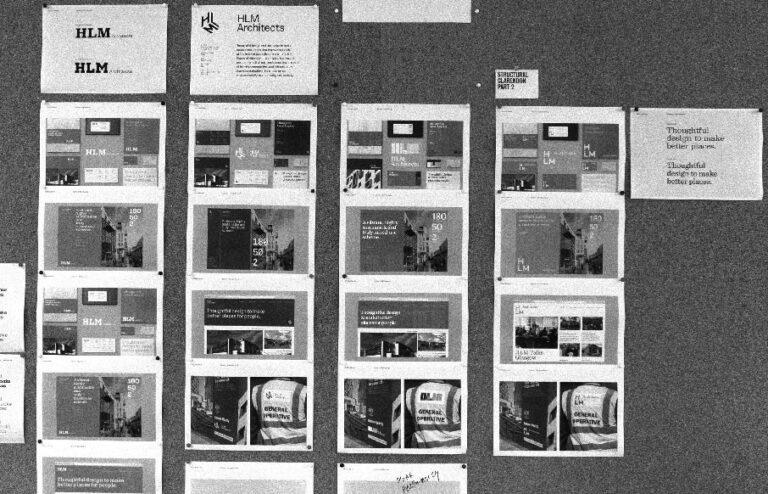
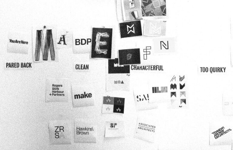
Cafeteria were asked to formulate a brand strategy that reflected HLM’s integral design philosophy. We undertook research, interviewed staff and clients, then built a strategy around the big idea of, ‘Thoughtful design to make better places for people’.
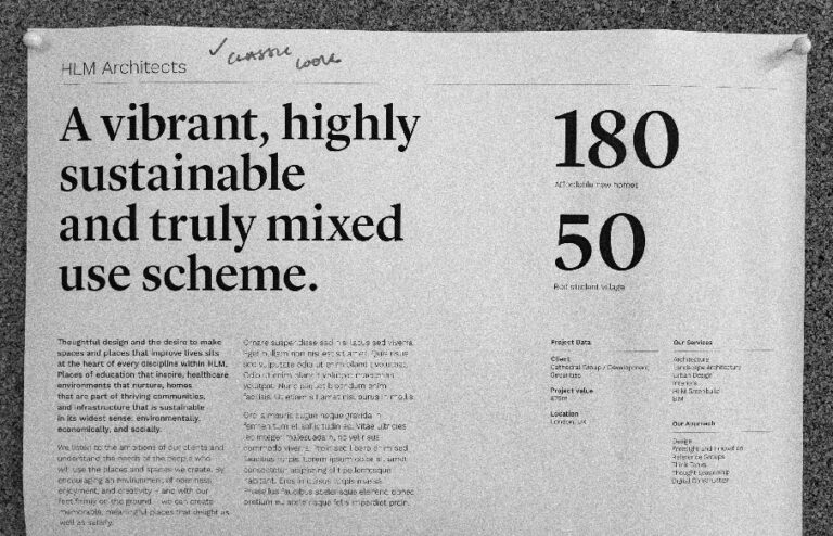
The visual identity needed to own an aesthetic clarity that spoke of HLM’s humanist and civic-minded values – from an expressive colour palette to open and characterful type. We drew and developed a simple motif that plays with space and nods to the shapes of buildings.


Paired with a grid system, the motif can flexibly respond to any format, and lends itself to animation. It reflects how HLM work – their process responding and adapting to different challenges in new, bold and creative ways.


With the brand identity in place, Cafeteria designed and built a new website for HLM – from the ground up. We placed the brand principles at the heart of the story, working closely with the client to shape content and create an entirely new web expression, consisting of full-width video, animated section headers, and user-friendly page layouts.


Cafeteria were great at managing the process of the rebrand and this aspect shouldn’t be overlooked. They were patient with us. They took the time to really understand the culture and ethos of the business. They immersed themselves in HLM, speaking to our staff, clients and peers to really get under our skin. In doing so they were able to distil our personality and articulate our values in a much better way than we could ourselves. I’m not in the habit of giving praise lightly, but I highly recommend Cafeteria.
Behind the project


