Latest project story
The Green Estate
The Green Estate
HLM Architects embody the idea of socially-driven architecture. With their emphasis on user-centric design, the practice focuses its efforts in creating places and spaces that improve lives. They strive to deliver places of education that inspire, healthcare environments that nurture, homes that are part of thriving communities, and infrastructure that is sustainable in its widest sense – environmentally, economically, and socially.
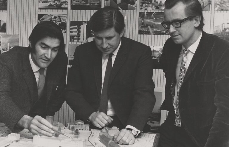
The practice was founded in 1964 by David Hutchison, Graham Locke and Tony Monk, having collectively won a competition to design the Paisley Civic Centre in Scotland. HLM has grown and evolved considerably over the past fifty-plus years and now has studios in seven UK cities – including London, Sheffield and Glasgow, and has established a global reputation for excellence.
In 2019, Cafeteria won the tender to design a new brand identity and website for HLM. It had become apparent that their existing identity – mainly consisting of a neutral, square logo, no longer communicated their culture or ambitions. We quickly understood that this disconnect was compounded by an inconsistent application of the identity across a range of disparate comms materials. These problems combined prevented them from talking about ‘who they are’ and ‘what they do’ consistently, and with confidence.
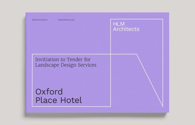
To resolve this, HLM asked Cafeteria to formulate a brand strategy that reflected the practice’s integral design philosophy. The strategy could then be used to inform a new, ownable visual identity – one that would continue to flex and scale-up with the business. Then, with everything aligned, a new website could be planned and built. This would be the most visible manifestation of the brand and provide a showcase for the depth and breadth of HLM’s award-winning portfolio.
With brand, insight is everything – the who, what, how and why. We needed to uncover a set of truths in order to form some foundations. To gain an inside perspective, we interviewed staff members across each studio location, asking them what they thought of the company and what it meant to work there. Through this exercise, we discovered a culture that puts people at the centre of everything – whether it was a desire to cultivate and invest in their teams, or their dedication to socially-orientated architecture. HLM had earned an internal reputation as a business with people at its heart.
But this was only one side of the story. To build a fully-rounded view, we needed to gain an external perspective. To do this we asked a series of open and honest questions to a varied sample of existing clients. The response? Overwhelmingly positive. The reason for this? The people. HLM’s clients valued and appreciated the level of expertise, unprecedented access and dedication that staff brought to their projects. They explained how HLM made the effort to really get to know the challenges of a brief and would take the time to develop a trusting relationship with the client, guiding them through each stage of the process and providing step-by-step reassurance. This ensured long-lasting and valuable partnerships – the driving force behind their success.
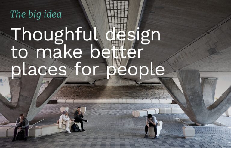
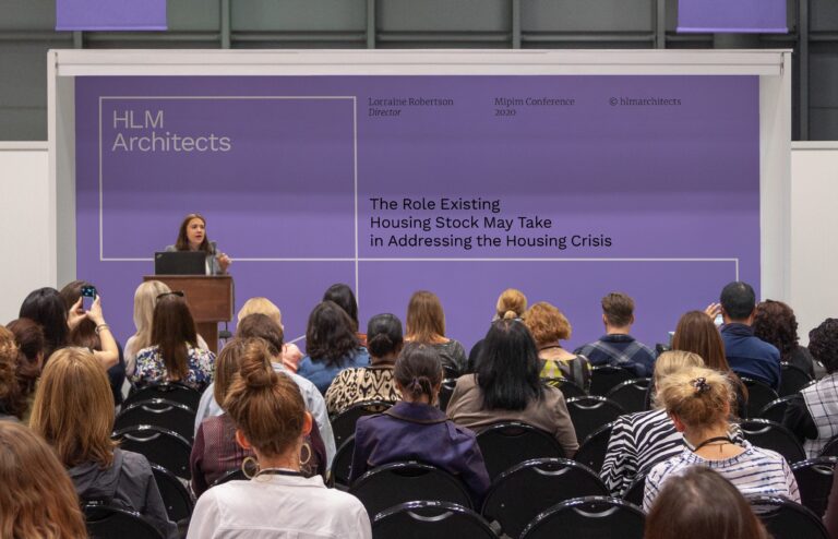
Having discovered this ‘truth’, we were able to focus our efforts into getting their story straight, which we knew started with putting people back at the heart of the HLM brand. We built a strategy around the big idea of, ‘Thoughtful design to make better places for people’. This was supported by three core pillars, underpinned by positioning, personality and values.
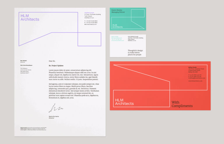
Guided by the brand, we moved into designing the visual identity. This needed to own an aesthetic clarity that spoke of HLM’s humanist and civic-minded values. Any system needed to suggest openness and flexibility – of both thoughts and actions, and it needed to present a joined-up approach to different disciplines, sectors and offices.
From a series of hand-drawn sketches on a layout pad, we developed a simple motif that plays with space and nods to the shapes of buildings. Paired with a grid system, the motif can flexibly respond to any format, and lends itself to animation. It reflects how HLM work – their process responding and adapting to different challenges in new, bold and creative ways.
We explored and selected a vibrant colour palette, which allows HLM to be more expressive, while maintaining control of the overall look and feel of outputs. Where type is concerned, we paired two Google fonts to ensure accessibility and versatility across a multi-site, multi-platform business. These were Work Sans – an open, characterful Sans Serif with good legibility, and Merriweather – a hard-working, easy-reading Serif.
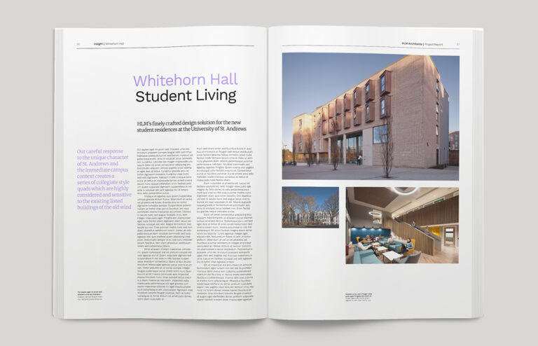
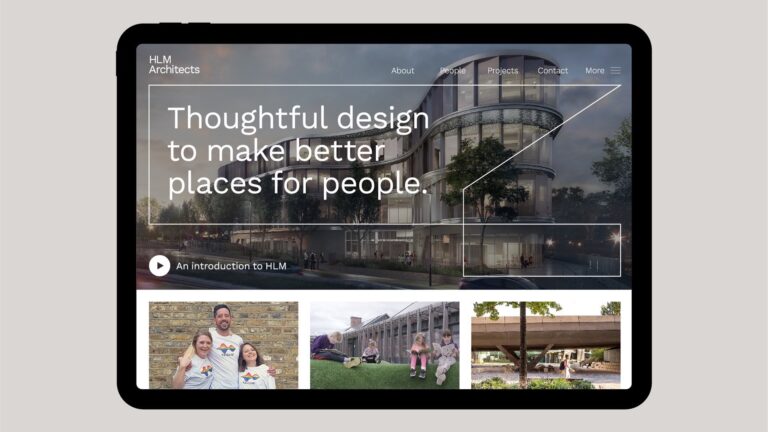
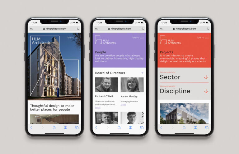
With the brand identity delivered, we conducted a full audit of HLM’s digital presence and existing website. A heavyweight content management system was an essential, owing to a large portfolio of project case studies, to be featured and filterable by either ‘Sector’ or ‘Discipline’. Cafeteria completely restructured HLM’s website, then built it from the ground up. We put the newly-developed brand principles at the heart of the story – reflecting them in the sitemap and navigation, and worked closely with the client to create an entirely new web expression, consisting of full width video, animated section headers, and consistent, user-friendly page layouts.
—
Both Cafeteria and HLM see creative partnership as key to developing great projects. Director and Head of Design, Philip Watson, sent us a great testimonial, and in doing so he wrote a better story about our process and partnership than we ever could. Take a look