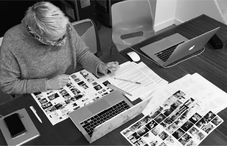
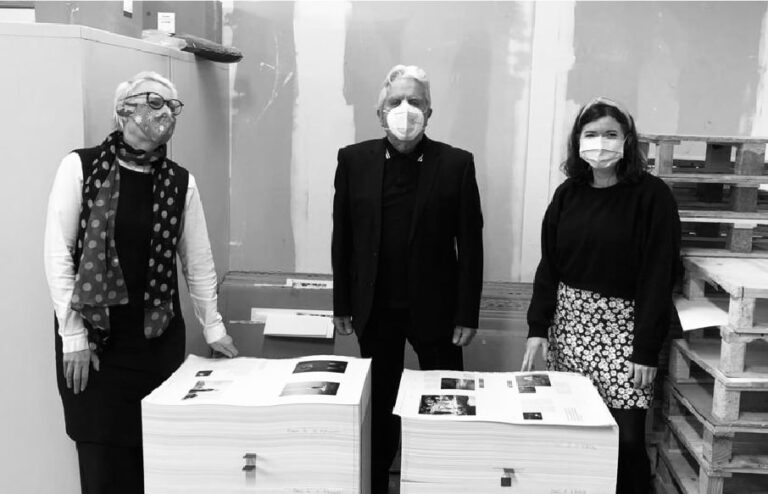
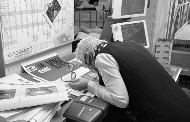
What was involved:
- Editorial
- Campaign

Brian’s work has received many accolades throughout his career. In 1989 The Guardian lauded him as ‘Photographer of the Decade’. Life Magazine featured his image for Depeche Mode’s Broken Frame, on the cover of their ‘World’s Best Photographers’ issue. And a number of his works are held in the permanent collections of the Arts Council, British Council, Victoria and Albert Museum and National Portrait Gallery, in London.


The initial challenge was to help raise the £30,000 needed to produce the book via Kickstarter. We created a versatile and distinct typographic style for use across various social channels, showcasing the creative intention of the book and building support.


Taking influence from the title of the book Black Country Dada 1969–1990, we chose Hoefler&Co’s Knockout to lead the design. The font offered a range of weights and widths, which mirrored Brian’s adaptability behind the camera and his affinity with the Dada movement.
Our design for the book presents eclectic editorial spreads — featuring distinct type pairings, structured columns of text and a harmonious balance of white space — alongside eccentric typographic compositions used for individual chapter starts.


Throughout the book, Knockout takes the role of both an expressive feature and a straight introduction to individual sub-sections. The body copy — what we saw as Brian’s voice — is set in Atlas Grotesk, a sans-serif font. And to contrast, pull quotes and ‘other voices’ who contributed to the book are set in Lyon, a serif font.


Our balance of typography, colour and editorial composition allowed Brian’s photographs to remain the prominent feature of the page but framed them in a way that considerately presented a rich, dynamic and expertly crafted portfolio of work.


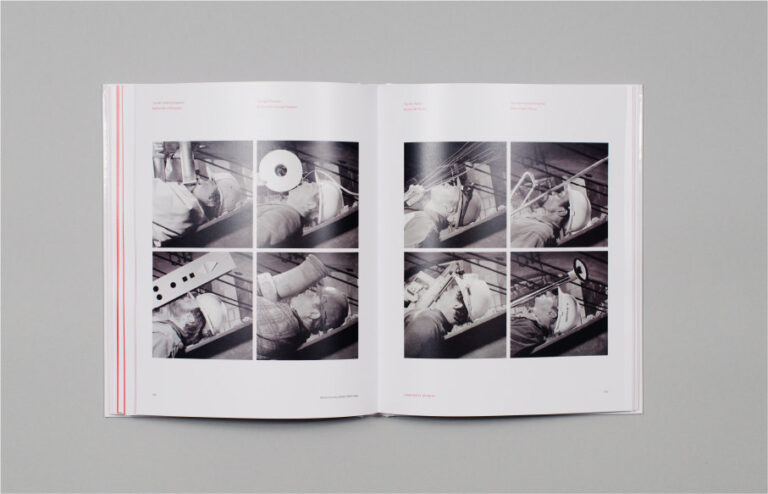
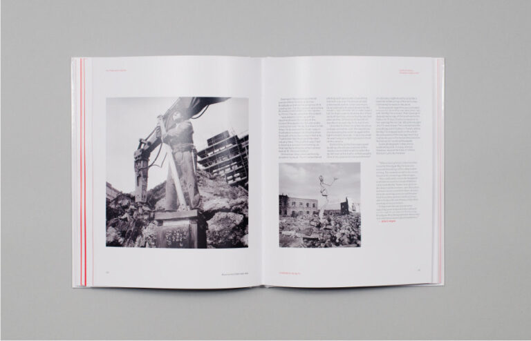
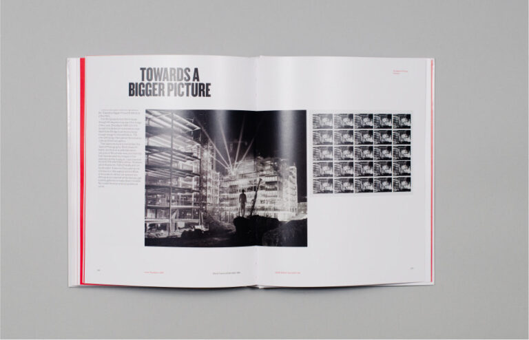
The completed book proudly presents itself with a glossy hardback cover, with a pin-sharp punch of black, red and white. The finished output feels like the book it was always meant to be — a unique biography and monograph — telling the story Brian wanted to tell. It is confident, characterful, fascinating and proud.
“In 2020 during lockdown I sat down and wrote my autobiography of my life from 1969–1990. I then needed a design studio that would not only design the book but would assist me via Kickstarter in raising the money to publish it. This whole process was handled efficiently by Cafeteria to the nth degree, succeeding initially in raising the finance, then designing the book beautifully, to create what one can simply describe as a classic.”
Behind the project
