Latest project story
The Green Estate
The Green Estate
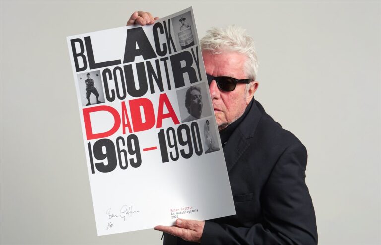
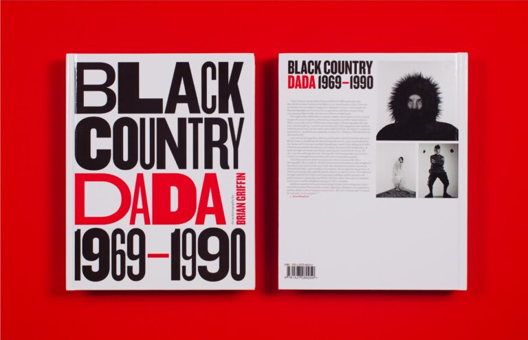
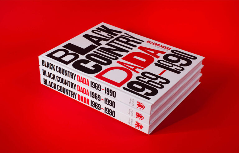
Award-winning and renowned British photographer, Brian Griffin, reflects on his life and career in his autobiography, Black Country Dada 1969–1990. Our design for the book showcases Brian’s eclectic body of work through expressive typography, stark punchy colour and meticulously considered composition.

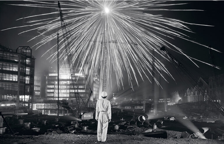
Brian Griffin is a world renowned photographer, whose work has received many accolades throughout his career. In 1989 The Guardian lauded him as ‘Photographer of the Decade’. Life Magazine featured his image for Depeche Mode’s Broken Frame, on the cover of their ‘World’s Best Photographers’ issue. And a number of his works are held in the permanent collections of the Arts Council, British Council, Victoria and Albert Museum and National Portrait Gallery, in London.
During the first Covid-19 lockdown of 2020, Brian began to reflect on this momentous career and began writing a manuscript detailing his work from 1969–1990. He came to Cafeteria with his ambition to self-publish his autobiography and entrusted us with his newest and dearest project. We were incredibly honoured and excited to work with Brian again, having previously designed his exhibition catalogue for Still Waters, part of the Format Festival at Derby Museum and Art Gallery in 2013.
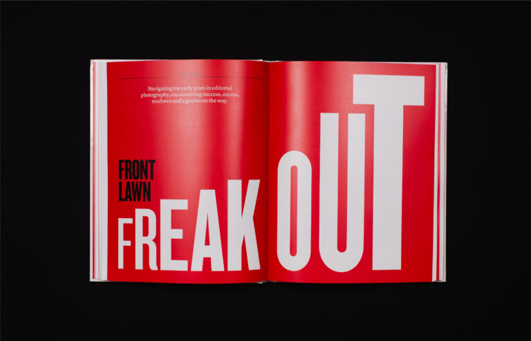
The initial challenge was to help raise the £30,000 needed to produce the book via Kickstarter. We created a versatile and distinct typographic style for use across various social channels, showcasing the creative intention of the book and building support. Taking influence from the title of the book Black Country Dada 1969–1990, we chose Hoefler&Co’s Knockout to lead the design. The font offered a range of weights and widths, which mirrored Brian’s adaptability behind the camera and his affinity with the Dada movement. The campaign quickly gained momentum and after a month of campaign promotion, the initial target was surpassed by over £8,000.
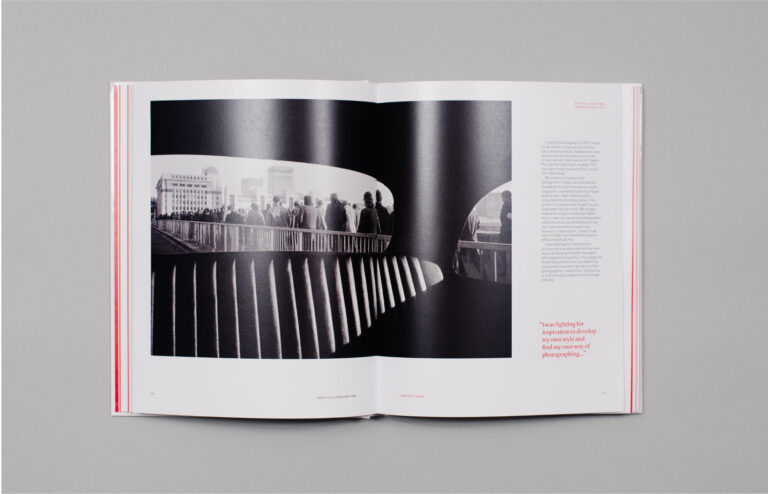
Filled with over 200 images including photographs from his personal archives, the original draft of the manuscript needed structuring to give it a formal pace and flow. Before any design began we worked with Brian to carefully collate and edit all of his text and images, giving us a better understanding of the content and an estimate of the total number of pages. This was a vital stage in shaping the eventual design and layout of the book, helping us to define an engaging and enjoyable reading experience.
Throughout our design process we balanced a number of design influences that interwove with Brian’s personality and career. We were fortunate to hear many personal stories about the incredible people he worked with, including Art Director Roland Schenk and Graphic Designer Barney Bubbles.
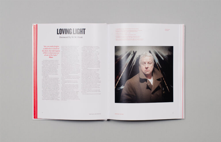
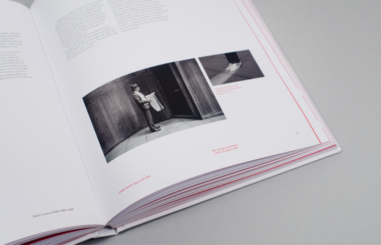
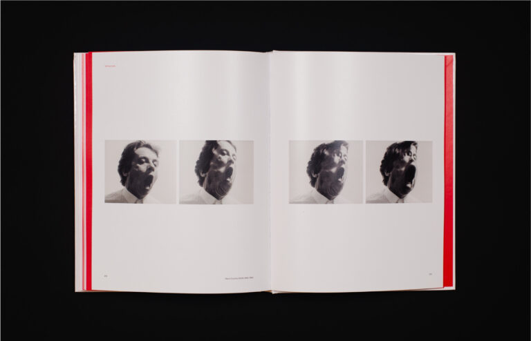
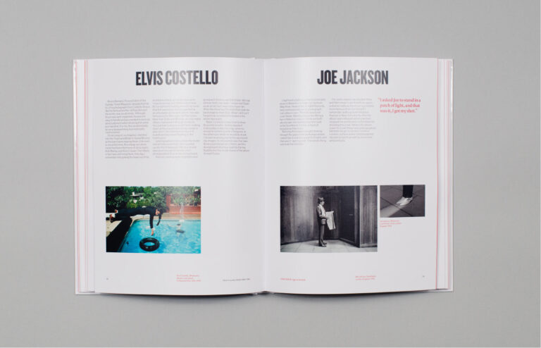
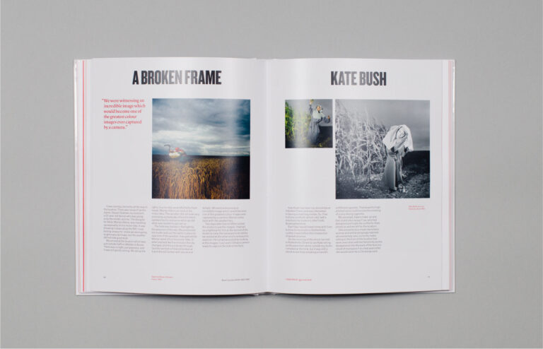
Our design for the book presents eclectic editorial spreads — featuring distinct type pairings, structured columns of text and a harmonious balance of white space — alongside eccentric typographic compositions used for individual chapter starts. Pages were built from a simple six column grid to accommodate the varying length and variety of the book’s content, allowing copy and imagery to be composed cohesively in single, double or triple column layouts.
Throughout the book, Knockout takes the role of both an expressive feature and a straight introduction to individual sub-sections. The body copy — what we saw as Brian’s voice — is set in Atlas Grotesk, a sans-serif font by Commercial Type. And to contrast, pull quotes and ‘other voices’ who contributed to the book are set in Lyon, a serif font also by Commercial Type. Overall, our balance of typography, colour and editorial composition allowed Brian’s photographs to remain the prominent feature of the page, but framed them in a way that considerately presented a rich, dynamic and expertly crafted portfolio of work.
The completed book proudly presents itself with a glossy hardback cover, with a pin-sharp punch of black, red and white. Internal pages are printed on Denmaur’s Arctic Snow, a semi-matt paper that allowed Brian’s photographs to be reproduced to their true original colour. The finished output feels like the book it was always meant to be — a unique biography and monograph — telling the story Brian wanted to tell. It is confident, characterful, fascinating and proud.
The book was launched to coincide with 2021 Format Festival where an online exhibition featured a virtual gallery of work from Black Country Dada. A pop up exhibition at By Residency in Islington Square in London, opened during the first easing of lockdown restrictions. Then after a successful run in Derby at Quad Gallery, the exhibition opened on the 1 October at The Oriel Gallery, Colwyn Bay. It runs until 30 January 2022.