Making the unbelievable, believable with a new brand and website for Atomhawk.

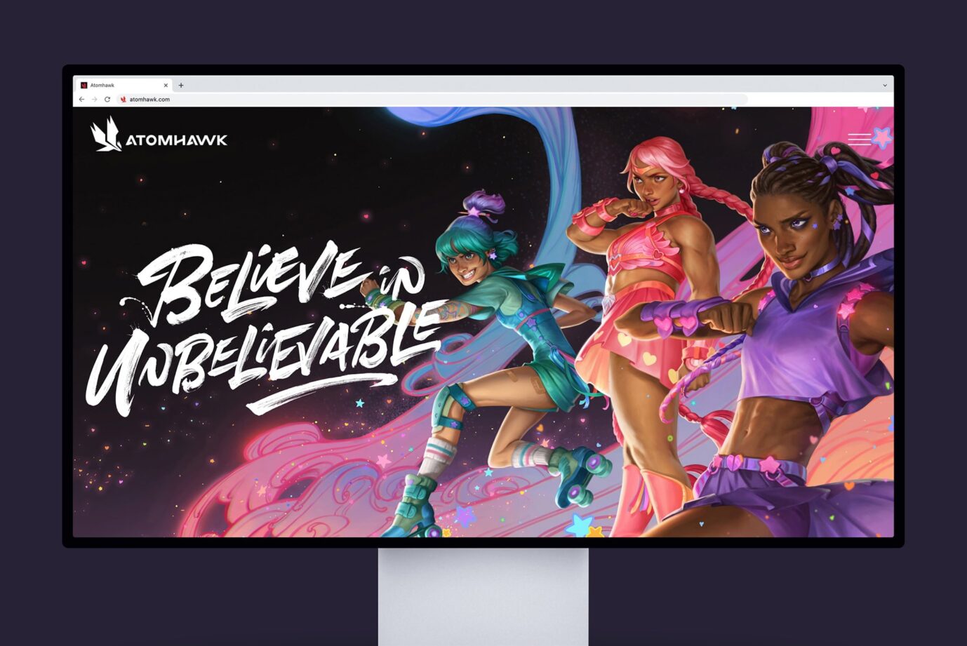
We have been working with Atomhawk — the games industry’s go-to partner for everything from concept to marketing art — to bring their brand identity to life, and showcase their incredible worlds of wonder with a new website.

Atomhawk have worked with some of the world’s greatest game developers on iconic titles such as Halo, FIFA, PUBG, and Mortal Kombat. Their diverse talent, experience, and skills are what make their offer unique and stand them apart from competitors. But it was clear that their existing brand and website had become a barrier to expressing this to their audience.

This challenge kickstarted a voyage of discovery for Atomhawk, which included internal and external strategic consultation. This journey culminated in a clearly defined brand purpose — to make the unbelievable, believable.

Atomhawk’s brand purpose became the guiding principle throughout our design work. We needed to not only display their incredible visuals but present a full expression of their process, and evidence their craft.

To achieve this we created a versatile brand identity, with a broad suite of visual elements. This includes a striking colour palette and colour gradients, sketch motifs and illustrations, and a typographic styling that combines a minimal Grotesk font family with a characterful handwritten face.

This flexible toolkit means the brand can be adapted to suit the needs of Atomhawk’s communications. It can act as a subtle complement to their captivating visuals or it can take the lead and present their story with high energy and vibrancy.

The character and versatility of the brand is fully realised in the design and build of Atomhawk’s new website. The site provides a rich and diverse user experience, where people can explore a variety of content — from full-screen visuals and immersive galleries to engaging stories and in-depth articles. Atomhawk’s art and the brand elements intertwine throughout the website, creating a premium, stylish and comprehensive expression of who they are and the amazing work they produce.

Working with a team that is so visually conscious, means responding to a lot of stakeholder needs and ambitions. But the end result has captured the individual qualities of the team and presents them as a collective ‘Supergroup’ who deliver exceptional work, every time. 

We look forward to continuing our partnership with Atomhawk into the future.

Project Credits:

Brand Identity & Website – Cafeteria
Web Build – Alan McDonald
Brand Purpose – Cravens
Type Illustration – Alison Carmichael via Jelly London
Copy – Chloe Corkhill
Photography and Videography – The Deli Film Co.