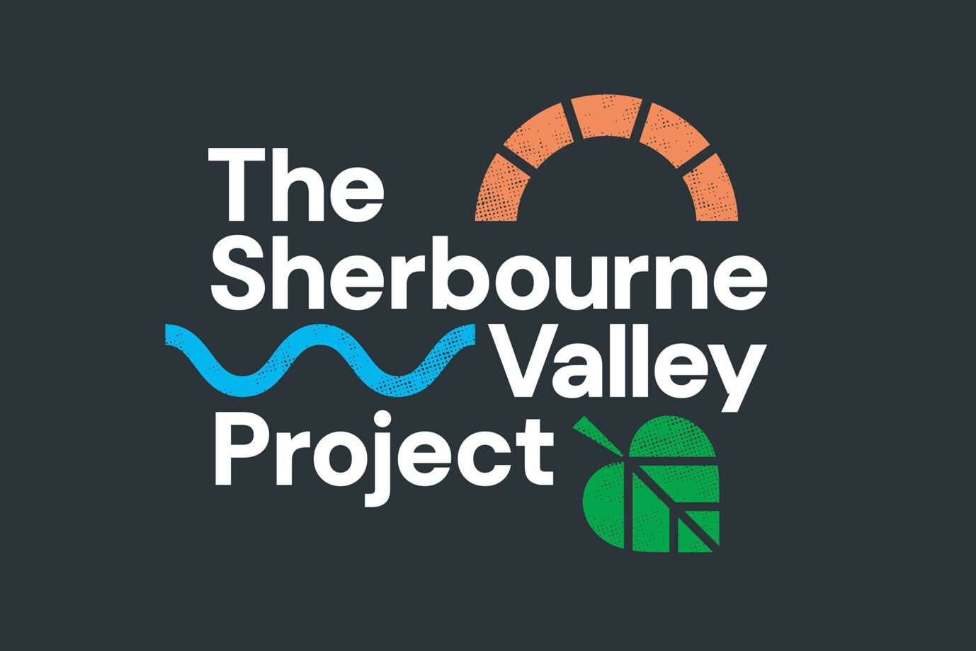
We created a new place brand for Warwickshire Wildlife Trust’s latest living landscape, The Sherbourne Valley Project.

The River Sherbourne flows through the city of Coventry and has been a contributing factor in the city’s growth for the centuries. But following heavy industrial activity, the health of the river and surrounding wildlife has severely deteriorated.

What was once a key feature of the city has slowly been hidden from view; in the 1960s the river was culverted (diverted through a pipe), leaving just a 30-metre stretch visible in the city centre. This has reduced public awareness of the river, its history, and how vital it is to nature, people, and the city environment today.

A new project by the Warwickshire Wildlife Trust (WWT) aims to change that by reconnecting people with their river. We have been working with the trust to create a bold and expressive identity for the project and the surrounding valley.
The Sherbourne Valley Project is the Wildlife Trust’s first urban living landscape, encompassing all-natural and green spaces along the course of the river, as well as a series of historical listed sites. The project provides an opportunity to engage an inner-city audience; helping to build a connection with the Trust and galvanize people to get involved with conservation work in their local area.

The new logo presents the key workstreams of the project, with distinct icons for built heritage, natural heritage and community engagement. This allows the WWT to quickly communicate the focus of their project. The look and feel of the identity aims to reflect the grassroots nature of the project — it needed to feel accessible to local people. The stencil style icons, touch on the idea of ‘craftivism’ and urban art. Anyone could adopt these simple shapes as part of wider community activities.

Given the urban audience, the brand didn’t want to look like a typical ‘nature’ project. This was no place for organic shapes or earthy tones. Instead colour is vibrant and punchy, with a stark contrast to the dark grey background. The colour palette was expanded to include designated colour combinations for each workstream, helping to distinguish between the different outputs and communications of the project.

As a further expression of WWT’s work, we created a set of icon patterns that represent the flora, fauna, landmarks, and activities of The Sherbourne Valley Project. These patterns can be used collectively, to promote the broader objectives of the project or individually on work stream specific communications, such as interpretation. The aesthetic of the brand icons are rough and ready. They speak to the hands-on vibe of the project and aim to encourage people to support a transformational campaign for change.

It’s always exciting to work on a brand for a place as there’s so much to explore and discover. It’s an opportunity to capture the culture and meaning of something and bring it to life for people to experience and enjoy. Coventry has some real energy and momentum behind it, particularly with it being the 2021 City of Culture. We look forward to continuing our work with WWT and seeing the impact and benefit The Sherbourne Valley Project brings to people and wildlife within the city.