Latest project story
The Green Estate
The Green Estate
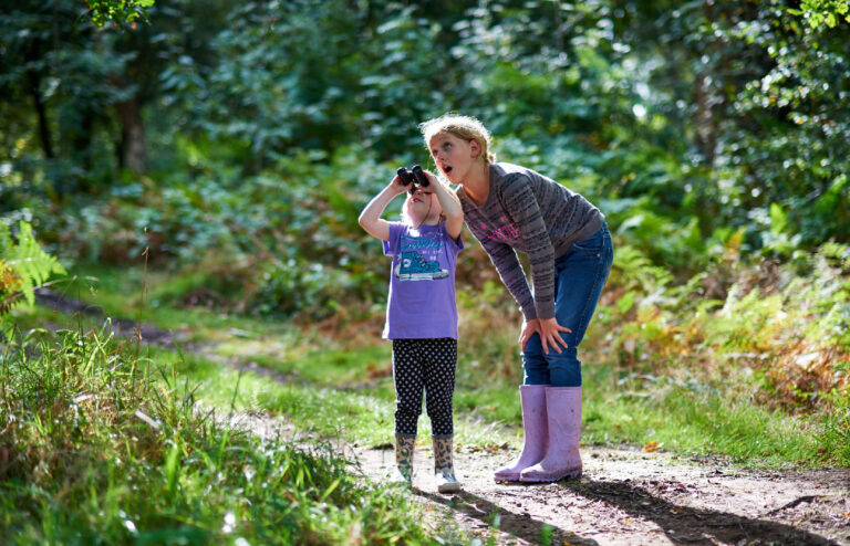
Sherwood Forest is a place that needs no introduction. Home to a wealth of flora and fauna, a thousand-year-old oak tree and most notably the legend of Robin Hood. But a new chapter in the history of Sherwood has begun and Cafeteria has played an important role in shaping the story.
In Summer 2018 an RSPB-led consortium took over management of Sherwood Forest. This includes opening a brand new multi-million-pound visitor centre, expanded conservation work and a raft of new visitor experience activities. To the RSPB, Sherwood is an opportunity to continue their commitment to making a home for nature while widening their horizons beyond their well-established range of nature reserves.
From the outset we all knew that it was not an RSPB branded reserve — Sherwood holds a unique place in the landscape, both real and imagined. The brand would need to represent a new era for the forest, set in motion by the RSPB and their partners but with the potential to withstand future changes.
Cafeteria understood the need for an overarching identity for Sherwood and the value of the RSPB brand, and crucially, the importance of setting out an unambiguous relationship between the two. To that end, nothing is above Sherwood, the RSPB’s identity remains uncompromised, and the hierarchy represents the promise made by the RSPB to act as guardians of Sherwood Forest — a precious asset for everyone to enjoy.
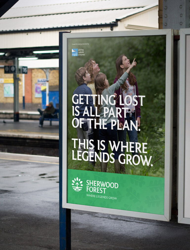
The visual identity is optimistic and open; ready to engage a new audience but remaining reassuring to current visitors, referencing familiar attributes of Sherwood. We steered well clear of any ‘ye olde’ connotations and instead created a clean contemporary identity that works in parity with the trust of the RSPB brand.
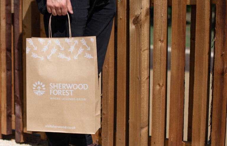
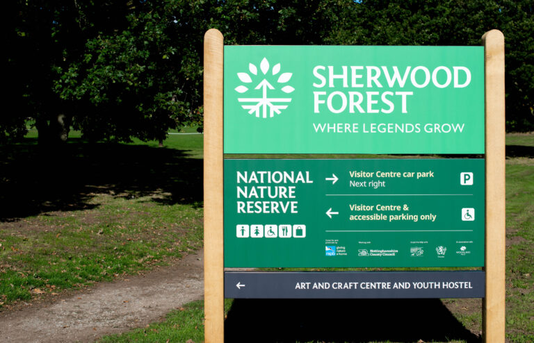
The logo comprises of three elements. The symbol shows a tree canopy with roots with the shapes echoing the arrowhead, shaft and fletching of an arrow. It blends and balances both the great oaks of the forest and the legend of Robin Hood.
The name, Sherwood Forest is set in a customised semi-serif font, Sherwood Sans – we crafted the weight, strokes and spacing of the letters to balance with the symbol. Set in bold capitals, the name is elegant, proud and assertive. Sherwood Sans is used throughout the identity as a headline font, setting a distinctive tone throughout communications.
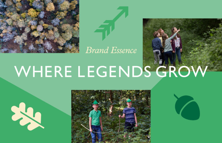
The name is underscored with the strapline ‘Where legends grow’. This is the essence of the brand. It’s an idea that captures the magic of Robin Hood, the majesty of the forest’s oaks and presents the forest as a place to discover, explore and leave with new memories and tales to tell.
To allow the ideas of brand to be more actionable we defined six themes that cumulatively deliver the brand essence of Where Legends Grow.
Nature, Active, Guardianship, Togetherness, History and of course, Robin Hood.
These themes are tangible, they provide inspiration, guidance and a measure for multiple areas of the project such as retail, catering, events and an activities programme. Having a brand with values that are easy to understand, articulate and act upon via these themes provides a strong framework to deliver the best experience for visitors.
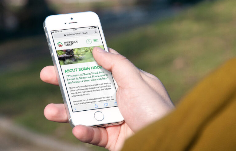
Synonymous with Sherwood, Robin Hood has a special place within the brand as a major theme. When considering who or what Robin is and how he should be represented, we drew inspiration from the quote “The spirit of Robin Hood lives forever in Sherwood and in the hearts of those who seek him.”
Everyone has their own idea of Robin Hood. He could be Errol Flynn to some and Disney Fox to others, Kevin Costner or a woodcut illustration. There is no singlular depiction as that would become restrictive longer term and would overshadow the wider mission and experience of Sherwood. We didn’t need to reimagine the character, but we did want his story to feel a part of Sherwood’s. By aligning the brand themes with Robin we create a shared connection that ensures wherever and however Robin exists, he exists in parallel with the full experience of Sherwood Forest.
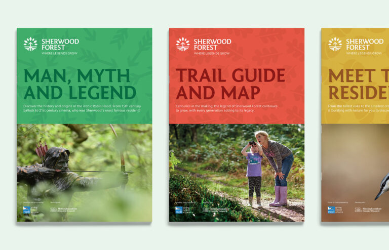
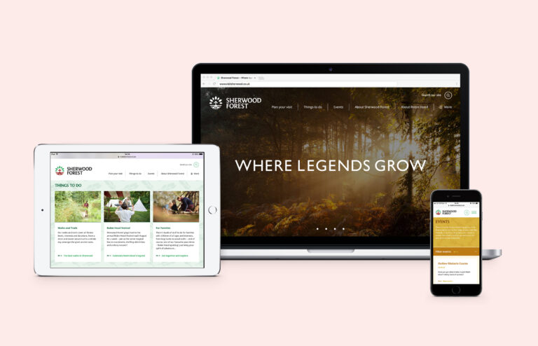
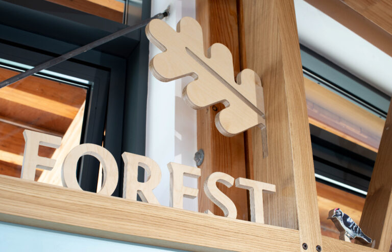
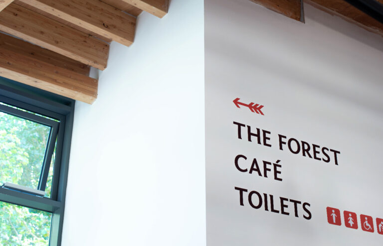
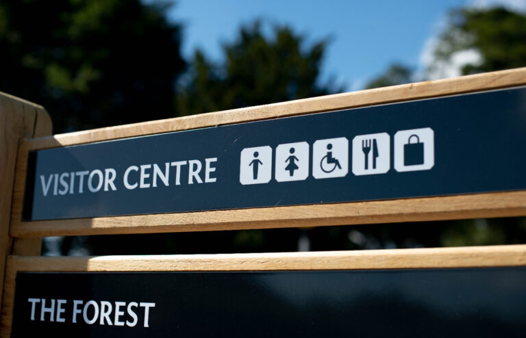
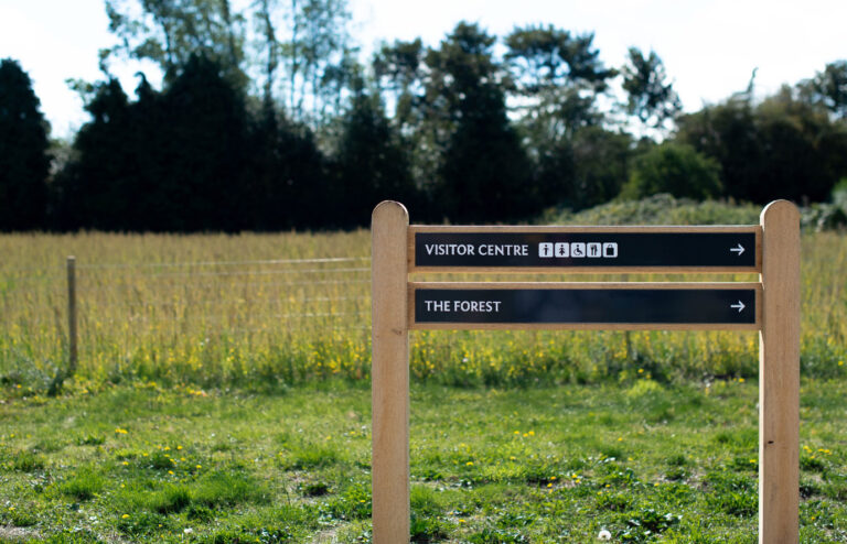
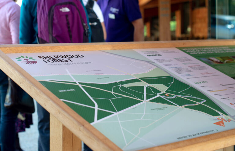
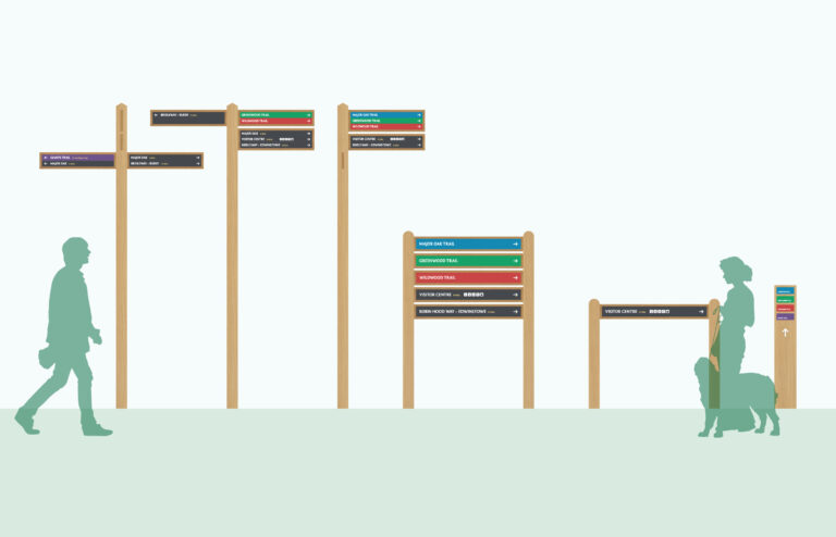
In addition to the brand, Cafeteria were responsible for delivering the website, promotional print, a wayfinding scheme for the whole site and environmental graphics inside the visitor centre.
In keeping with the brand, the website and signage are clear, functional and welcoming with the user experience central to their design. Navigation online and in the forest is about providing the right information for visitors to confidently decide what they want to do. The website content focuses on planning your visit while the signage system guides visitors along the main paths and specific trails.
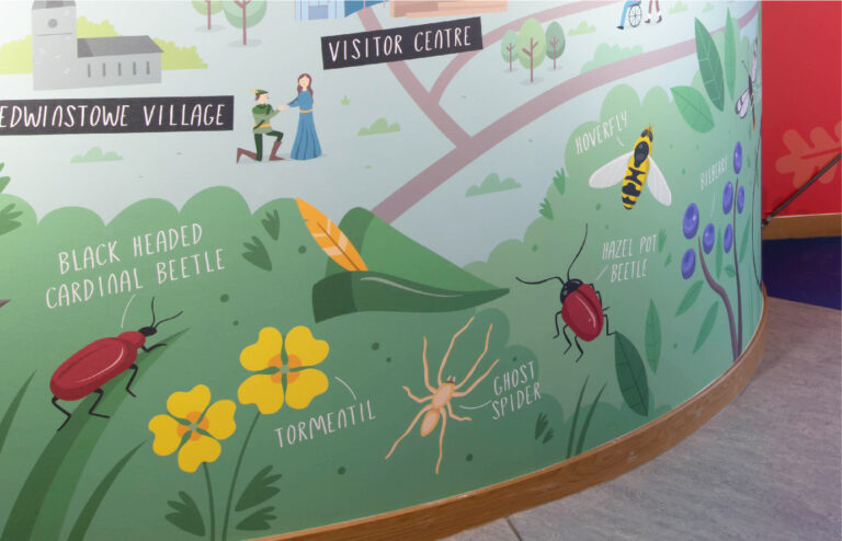
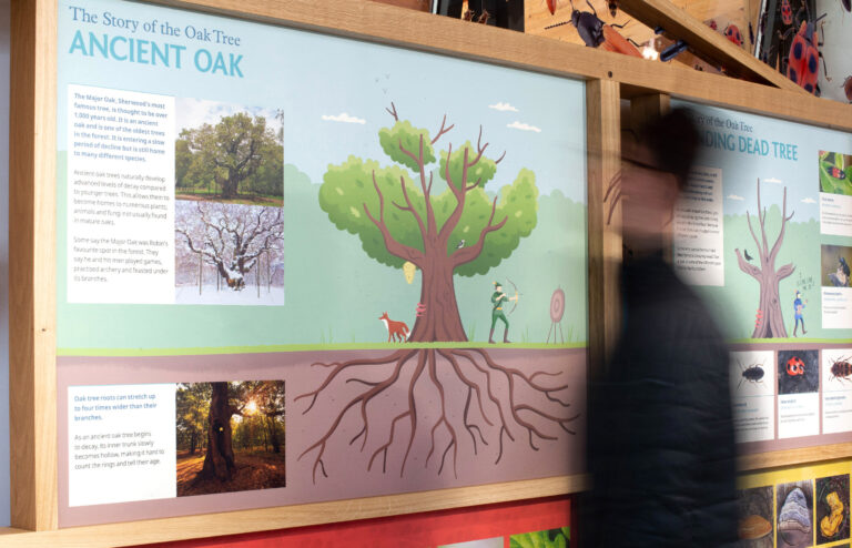
A vibrant illustration of the forest greets you on entering the new Visitor Centre. A closer look finds Robin, Marion and co. mingling with picnickers, dog walkers and nature watchers, enacting famous moments from legendary tales. Characterful trees, birds, bugs and plants all combine to create a welcoming picture that encourages visitors to get into the forest and explore. We worked with illustrator Tom Woolley to create the wall and also add visuals to the interactive Life in the Forest interpretation display.
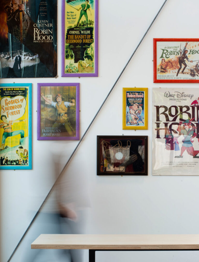
The cafe space plays host to the legend of Robin with a selection of vintage film posters and memorabilia. This was an essential part of bringing Robin into the Sherwood experience — engaging visitors with the legendary story and a Robin Hood that means something to them.